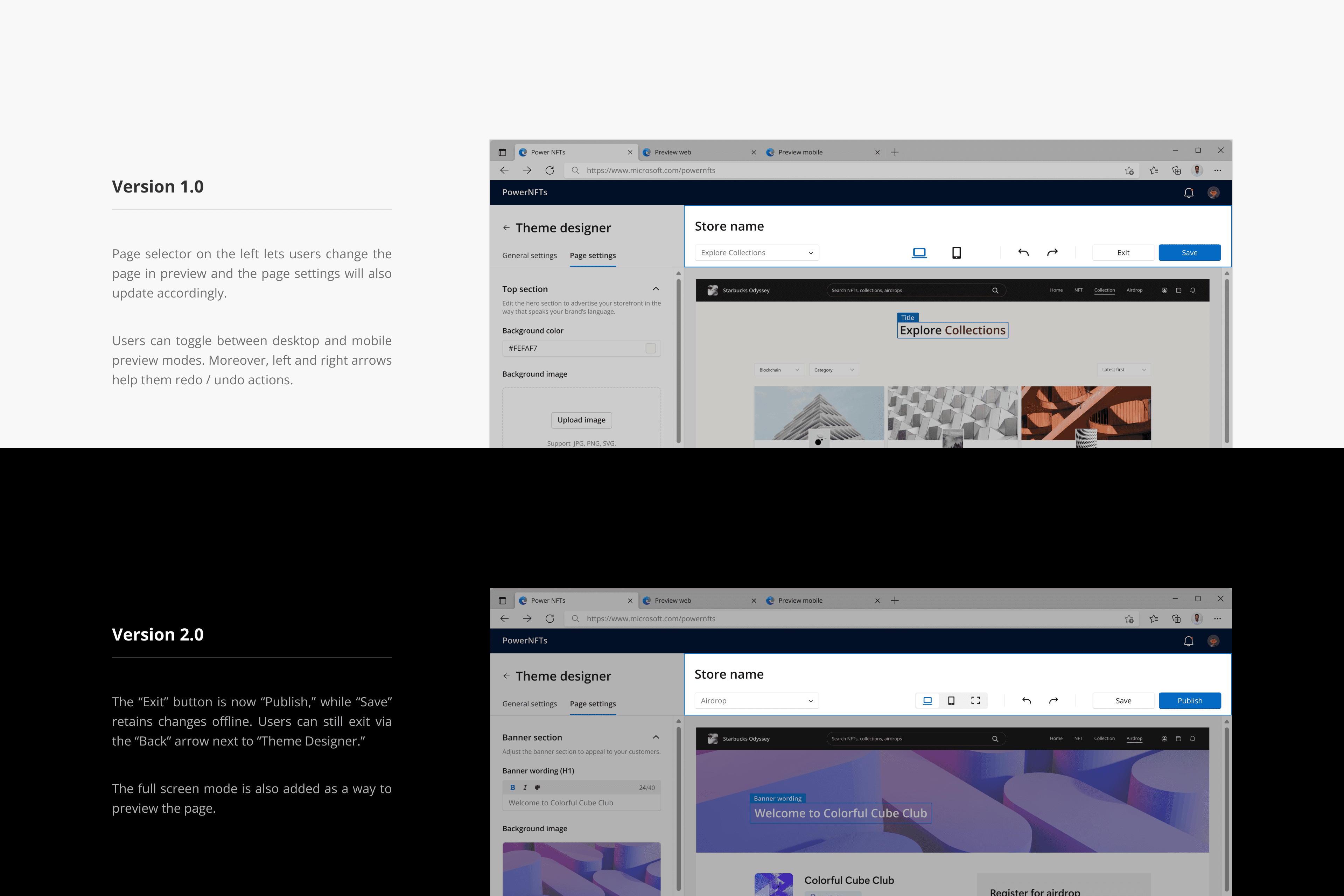
Theme Designer
Theme Designer
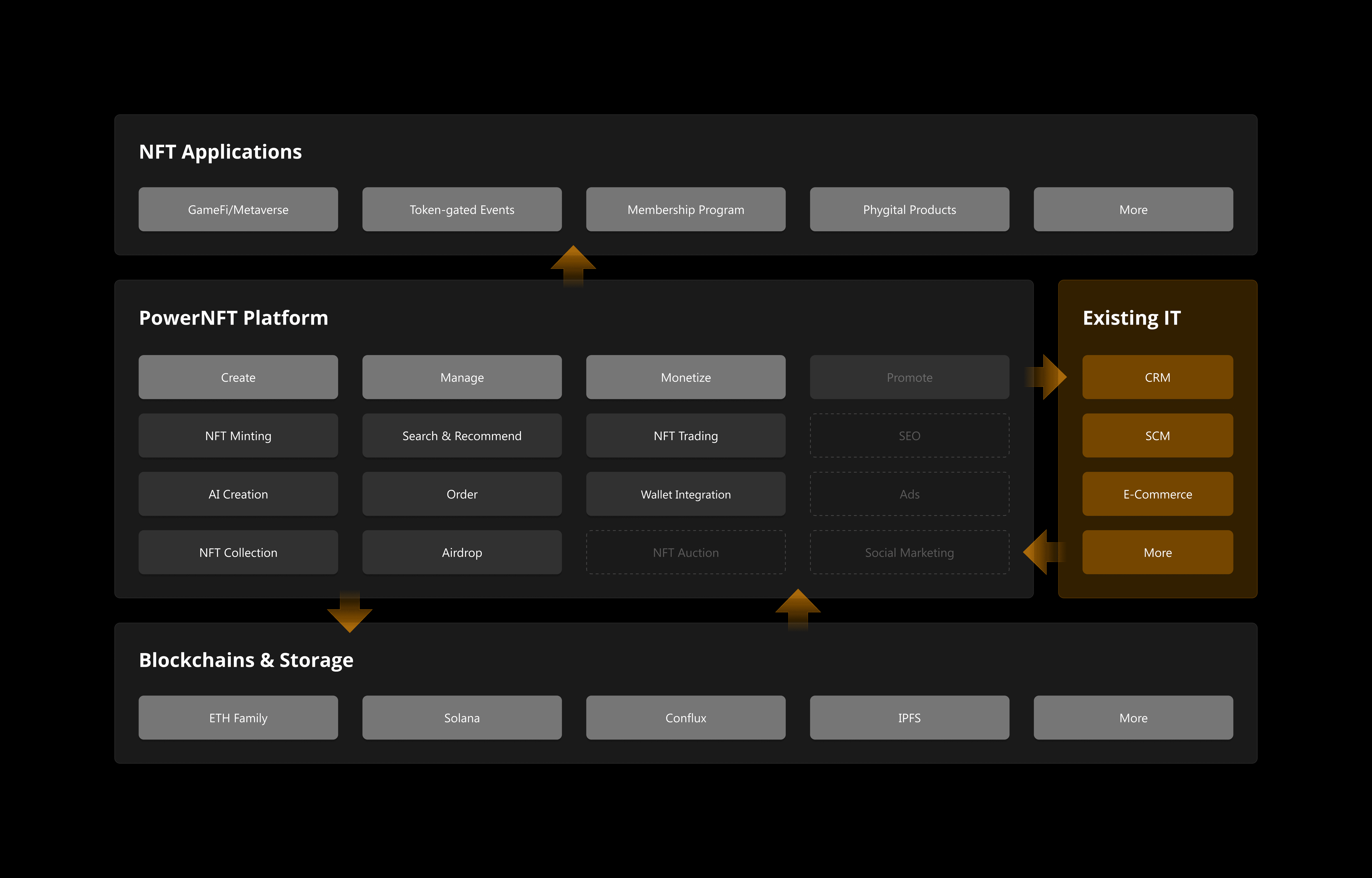
I took charge of the design project for Microsoft’s PowerNFT platform, from inception to end.
I took charge of the design project for Microsoft’s PowerNFT platform, from inception to end.
Duration
Duration
5 Months
5 Months
Role
Role
Product Designer
Product Designer
Company
Company
Microsoft
Microsoft
Project type
Project type
UX/UI, SaaS, Web3
UX/UI, SaaS, Web3
Tools
Tools
Figma, Teams
Figma, Teams
01
01
Background
Background
02
02
Role Duties
Role Duties
03
03
Outcomes
04
04
Design Problem
Design Problem
05
05
Target Users
Target Users
06
06
Hifi Showcase
Hifi Showcase
07
07
Storefront Design
Storefront Design
Storefront Sitemap
Storefront Sitemap

08
08
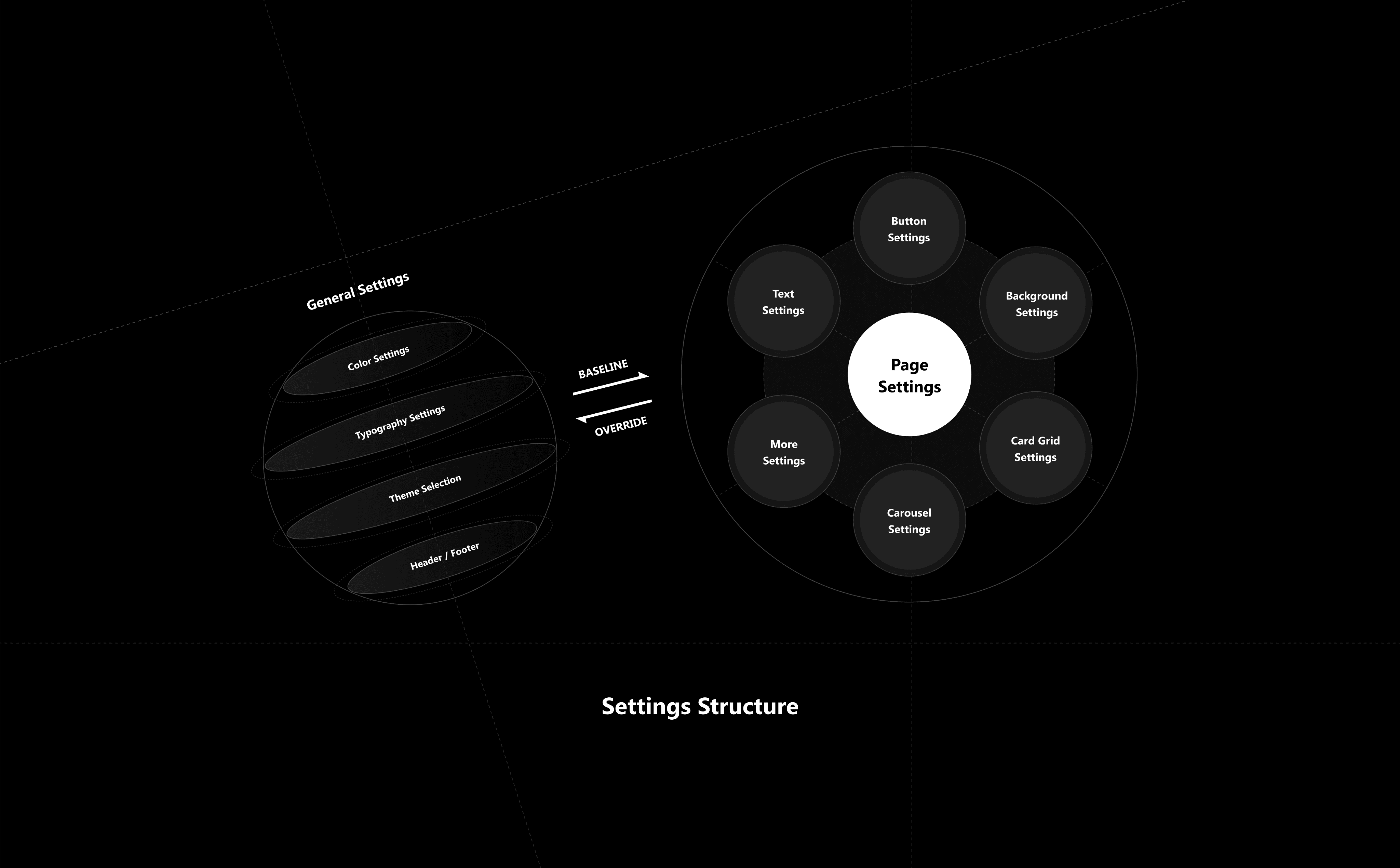
General settings
General settings
Existing Templates
Existing Templates
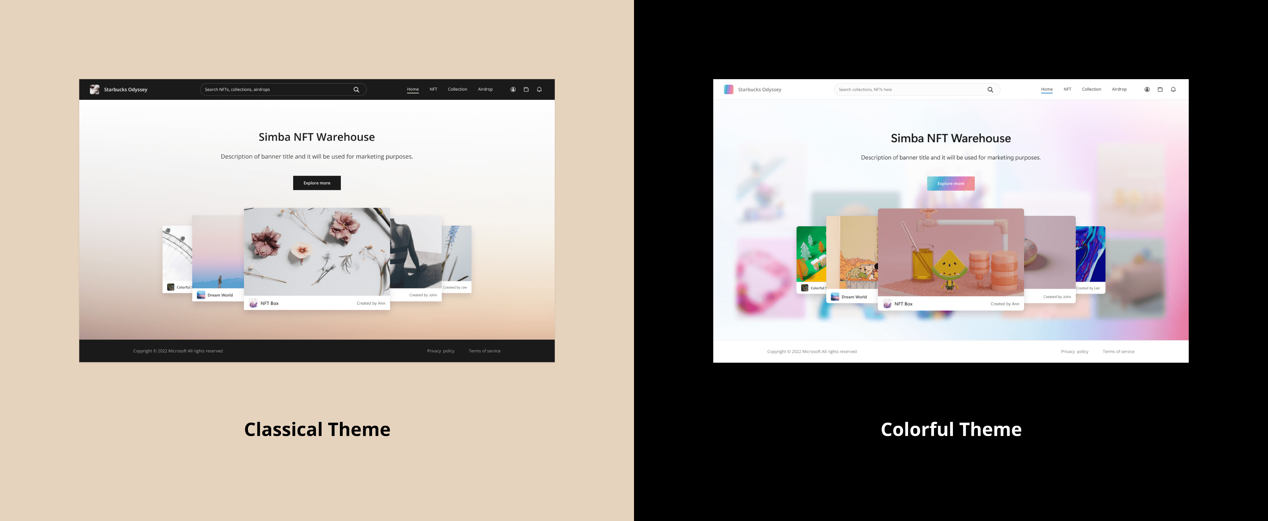
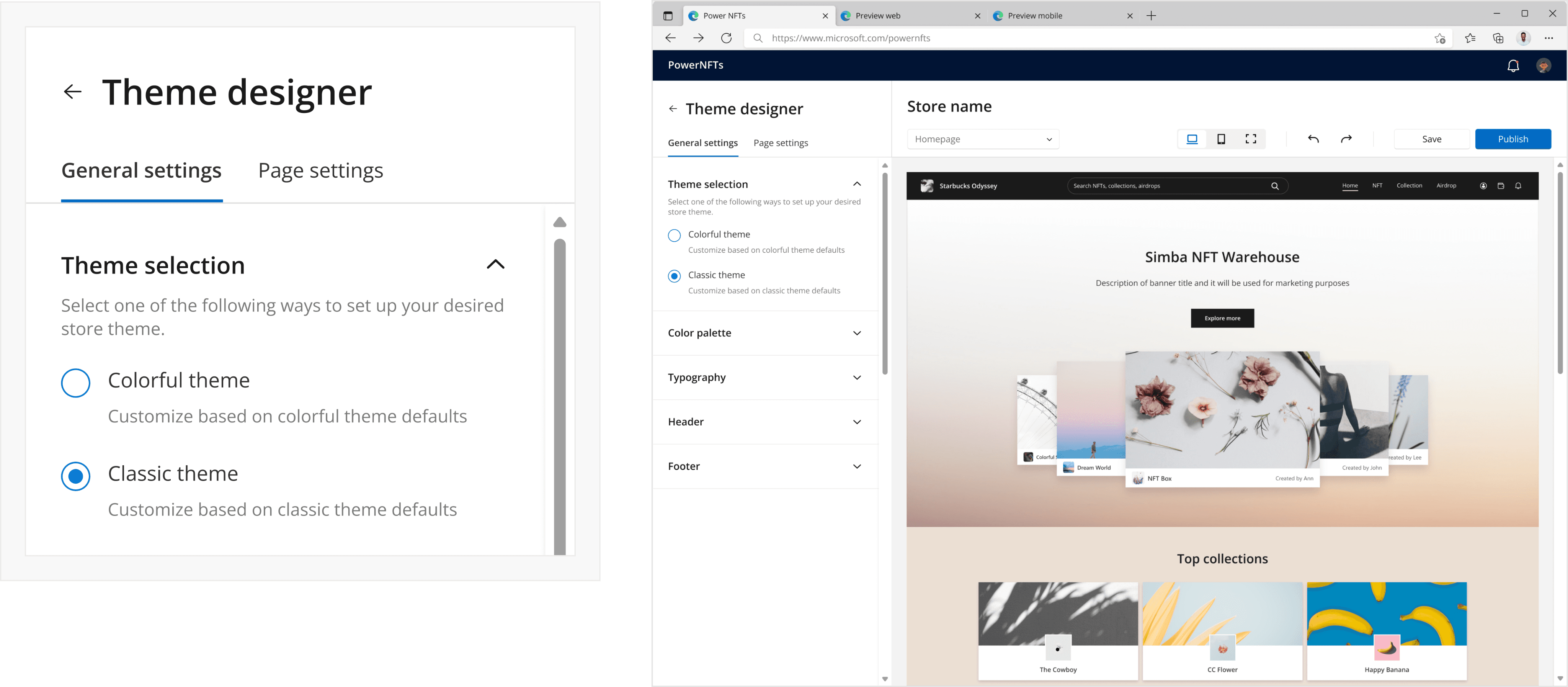
Template Selection
Template Selection
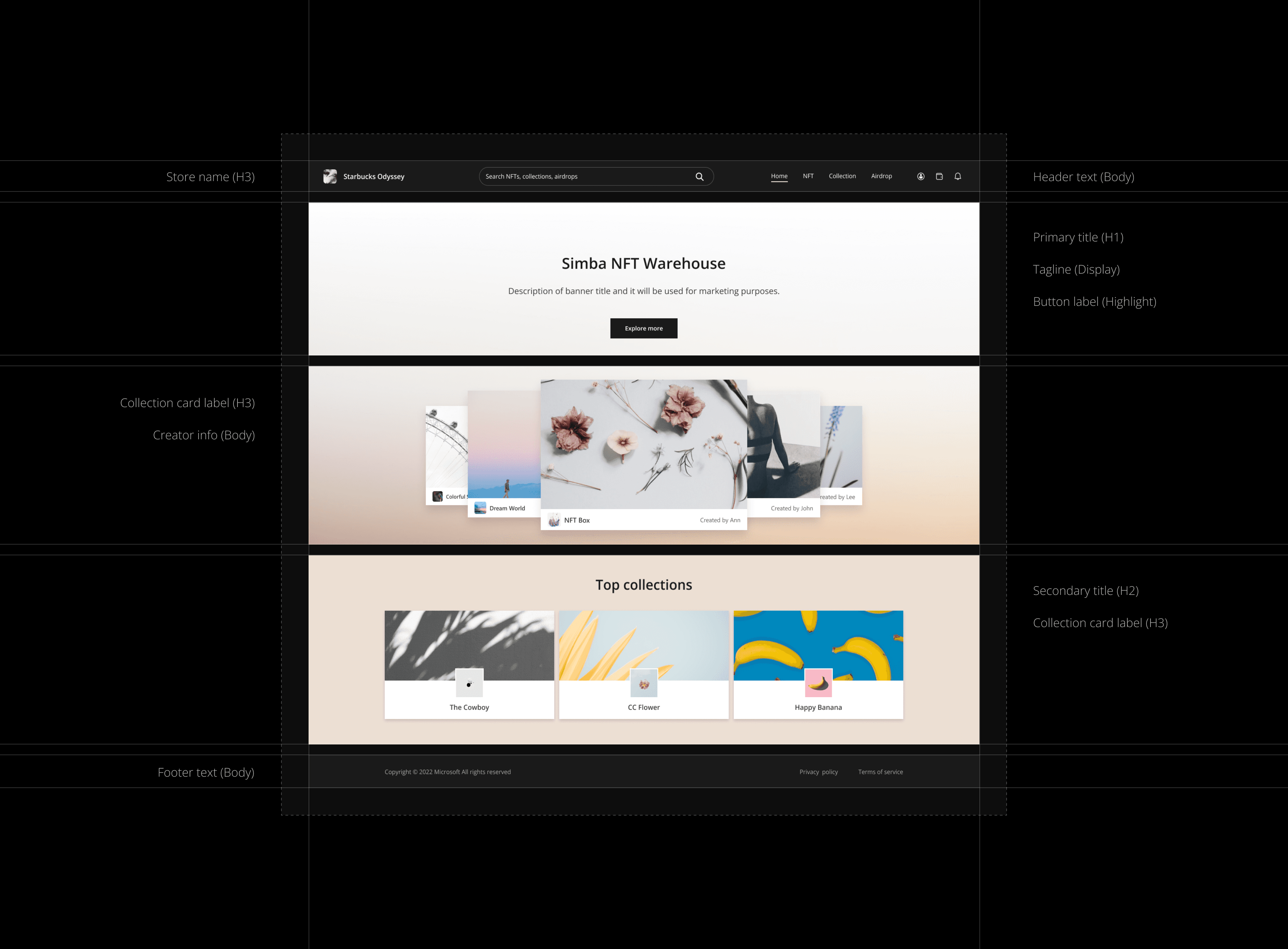
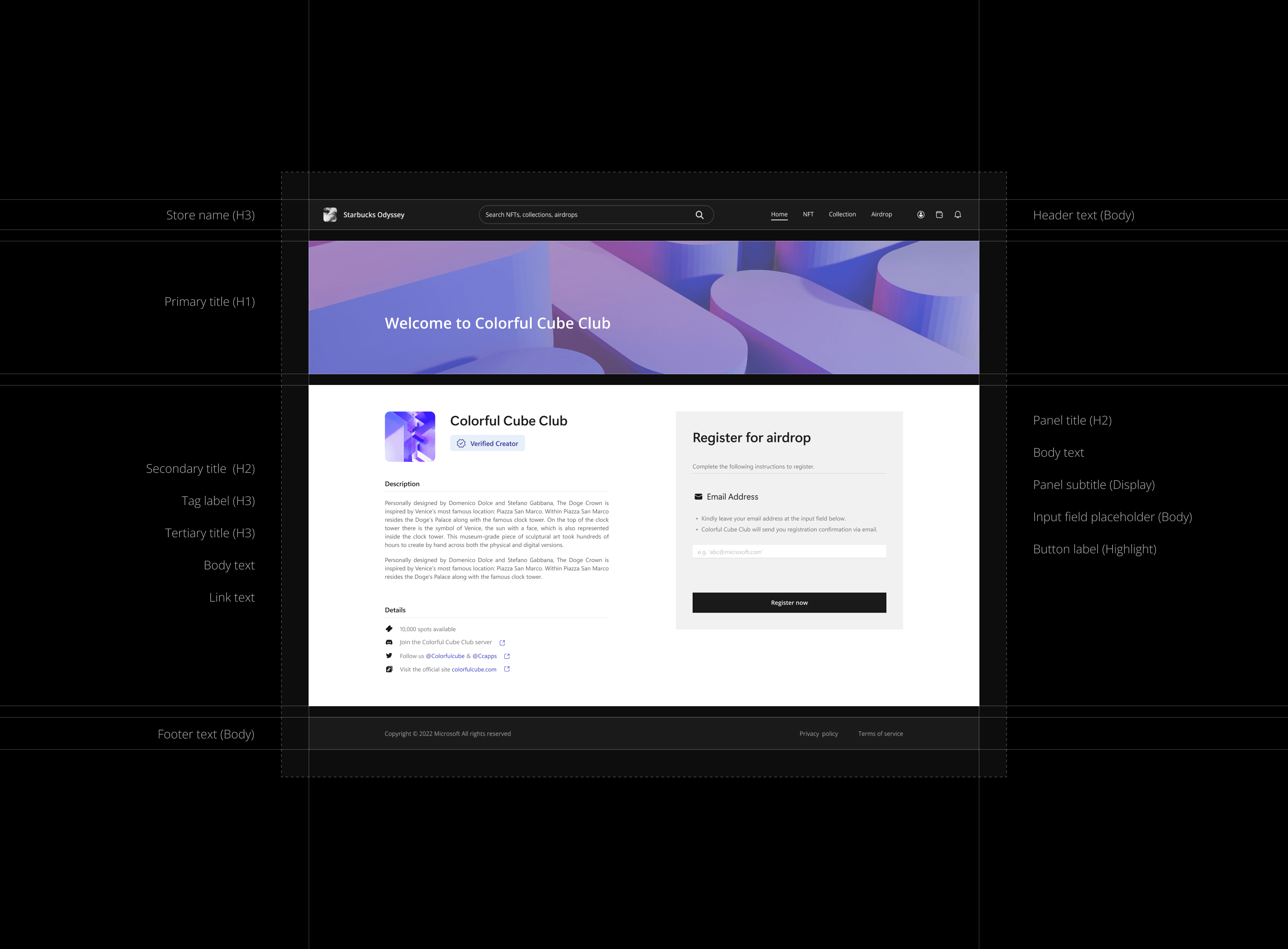
Text Hierarchy
Text Hierarchy
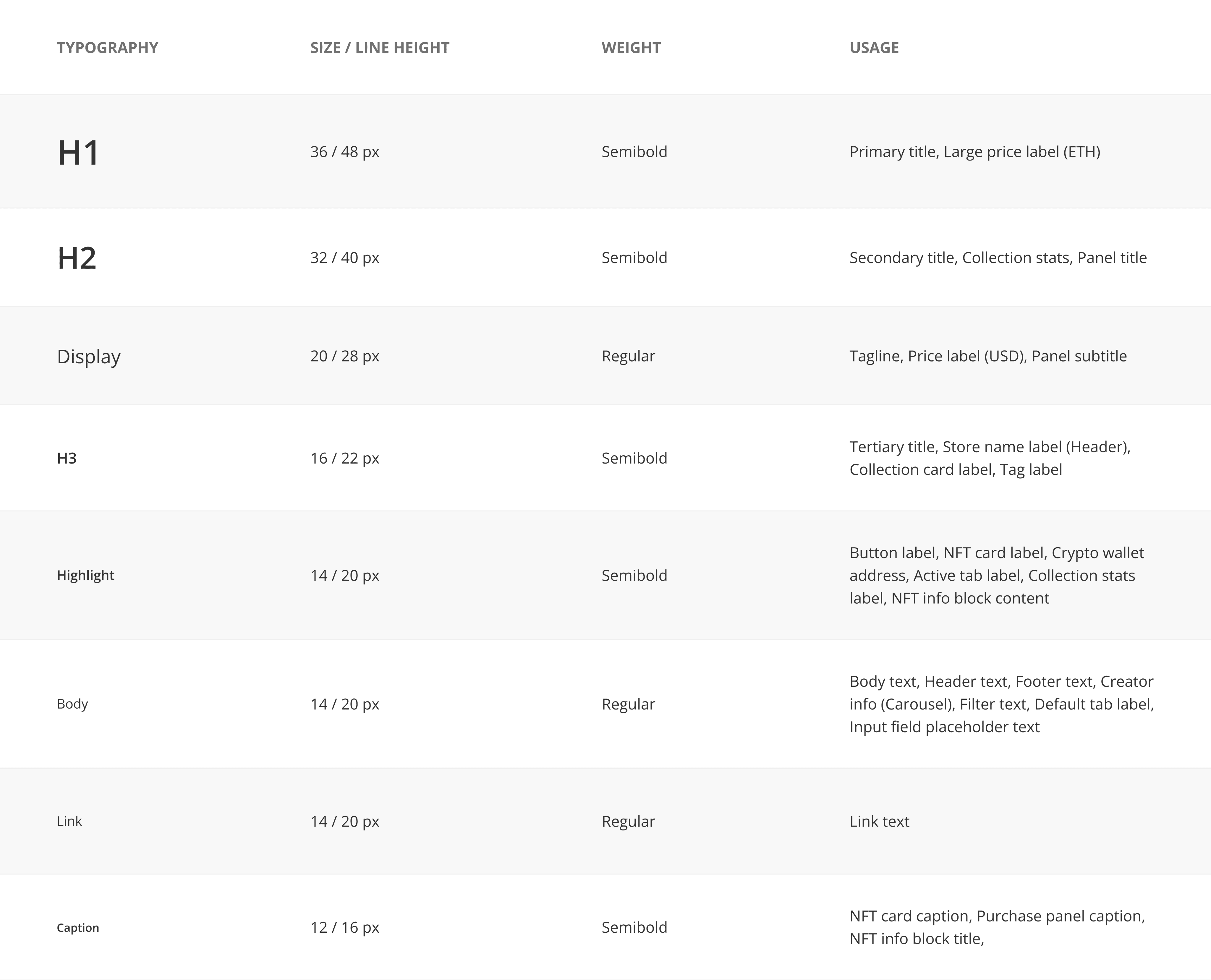
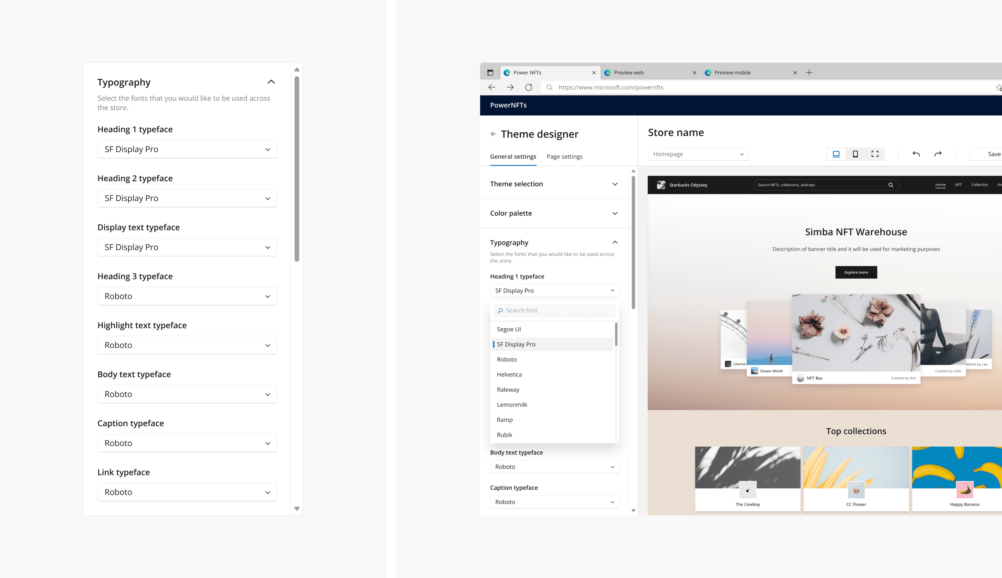
Typography Settings
Typography Settings
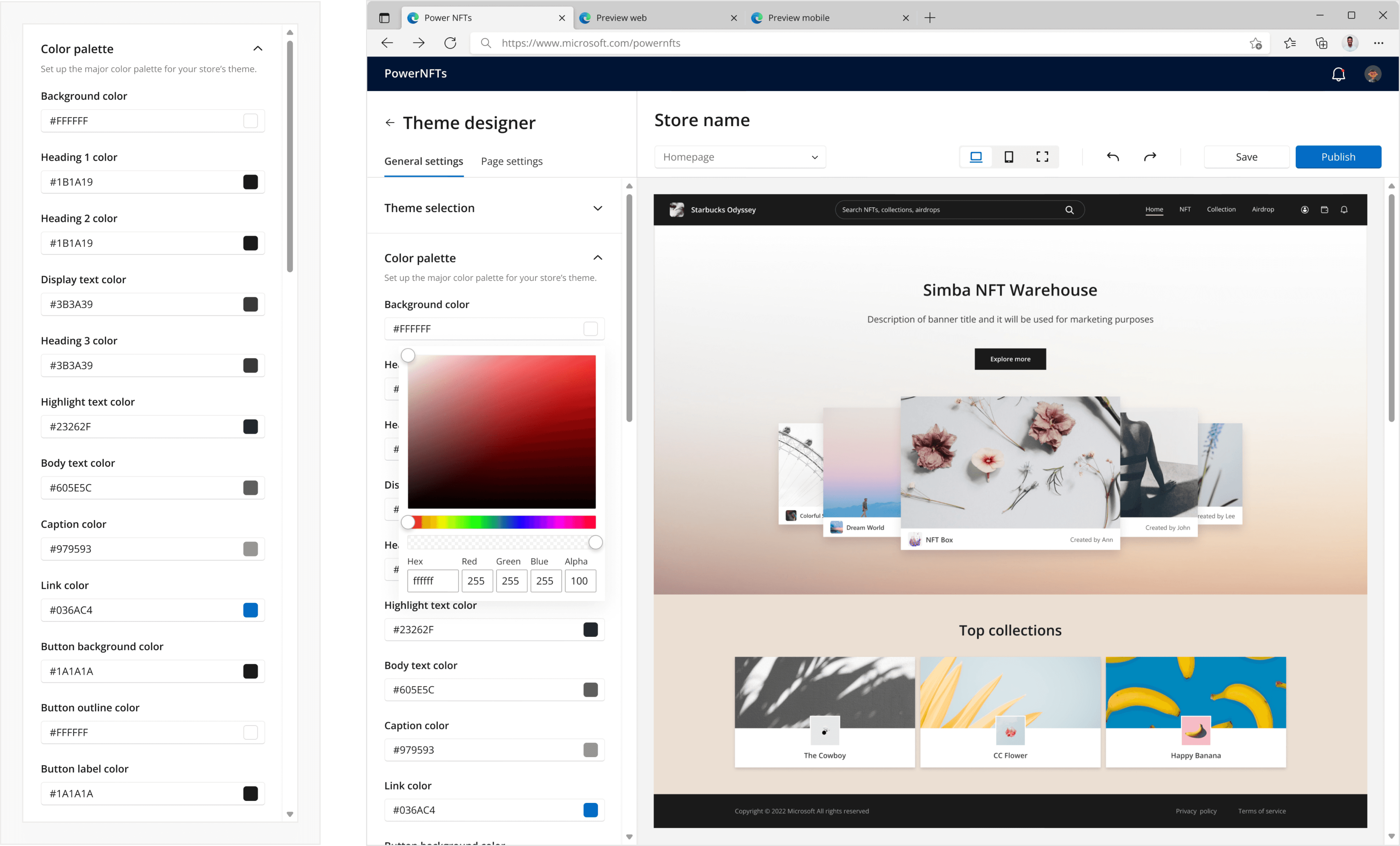
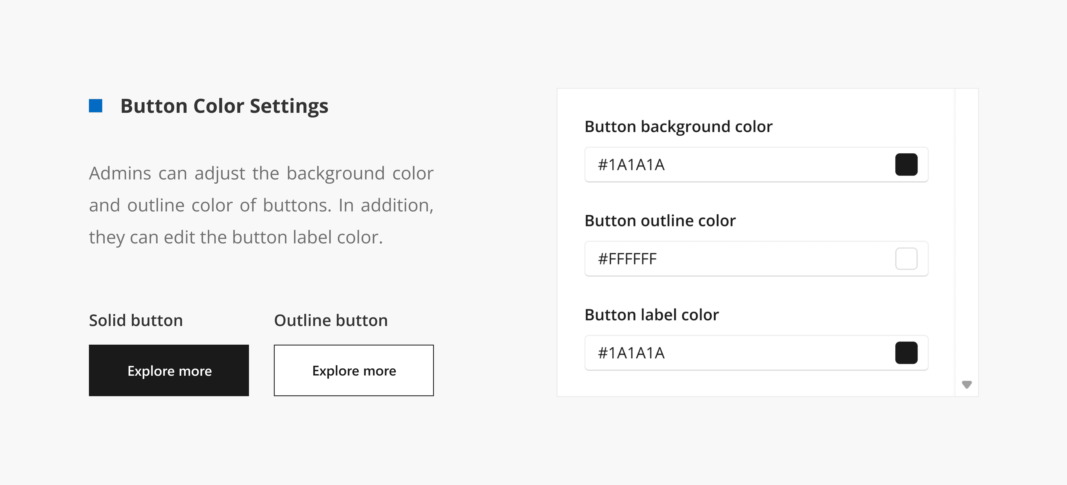
Color Settings
Color Settings
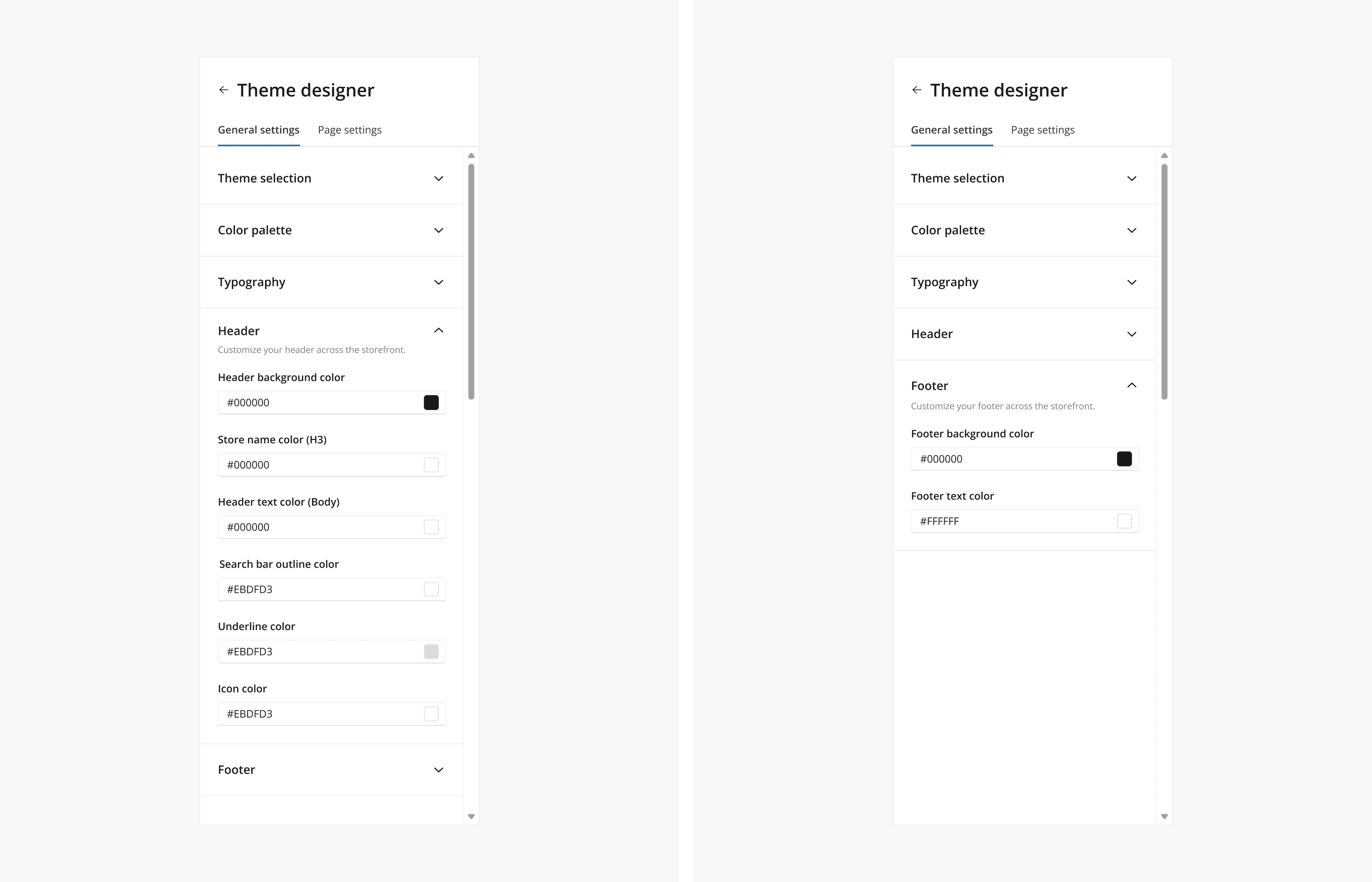
Header & Footer
Header & Footer
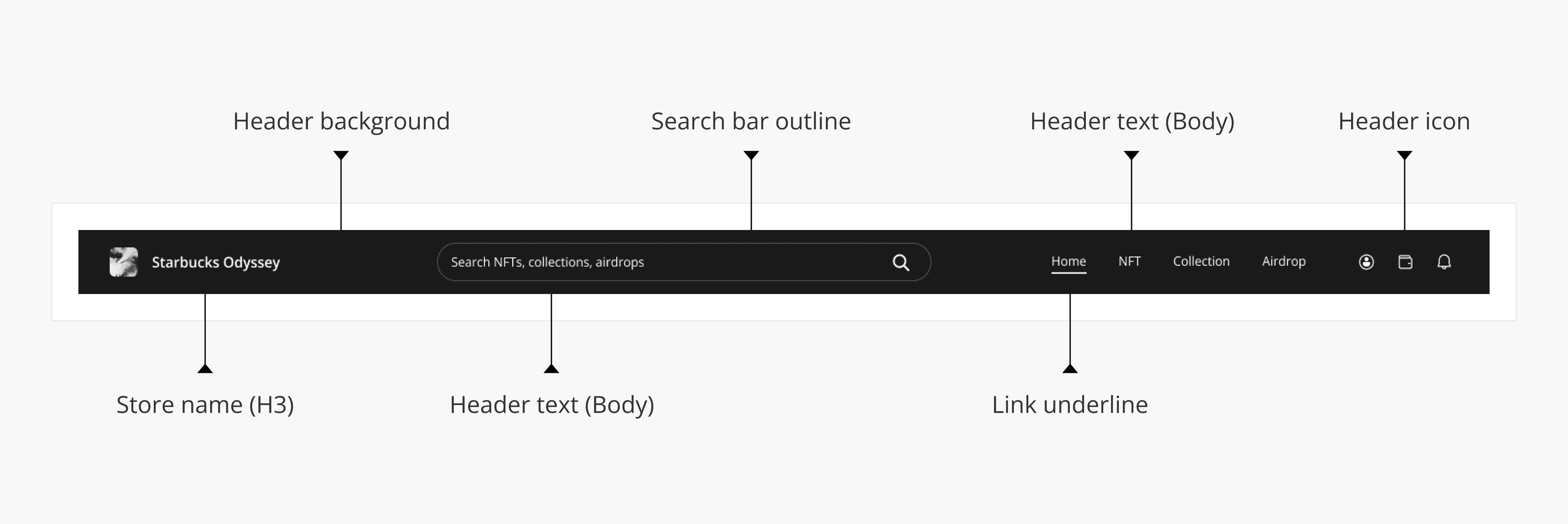
Header Structure
Header Structure
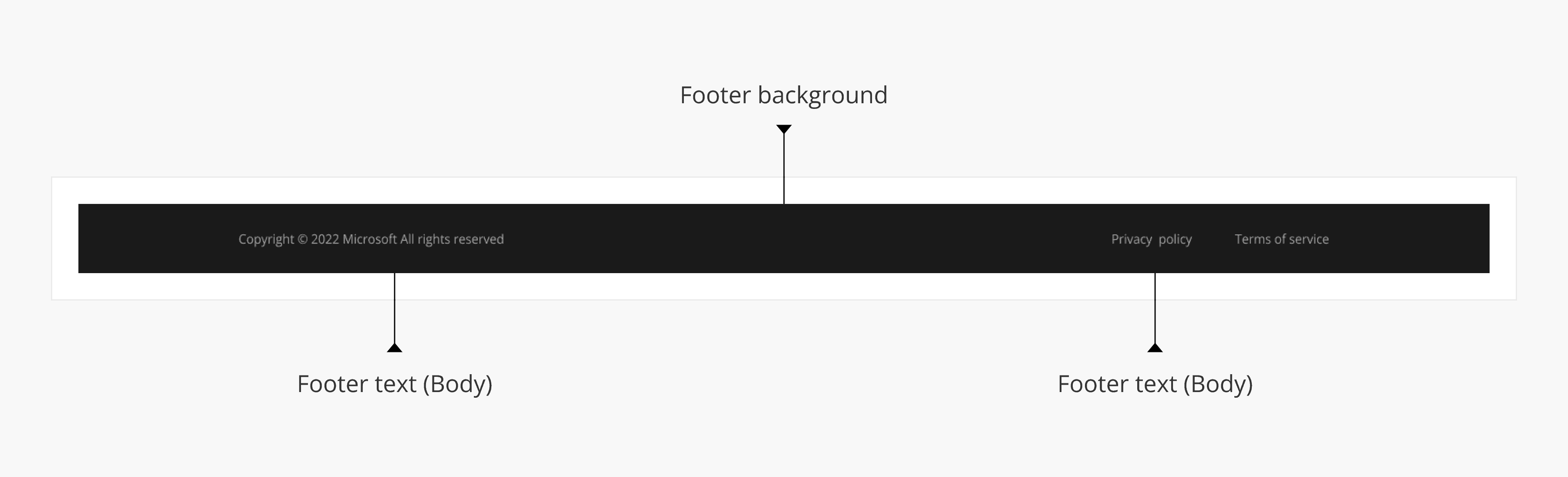
Footer Structure
Footer Structure
09
09
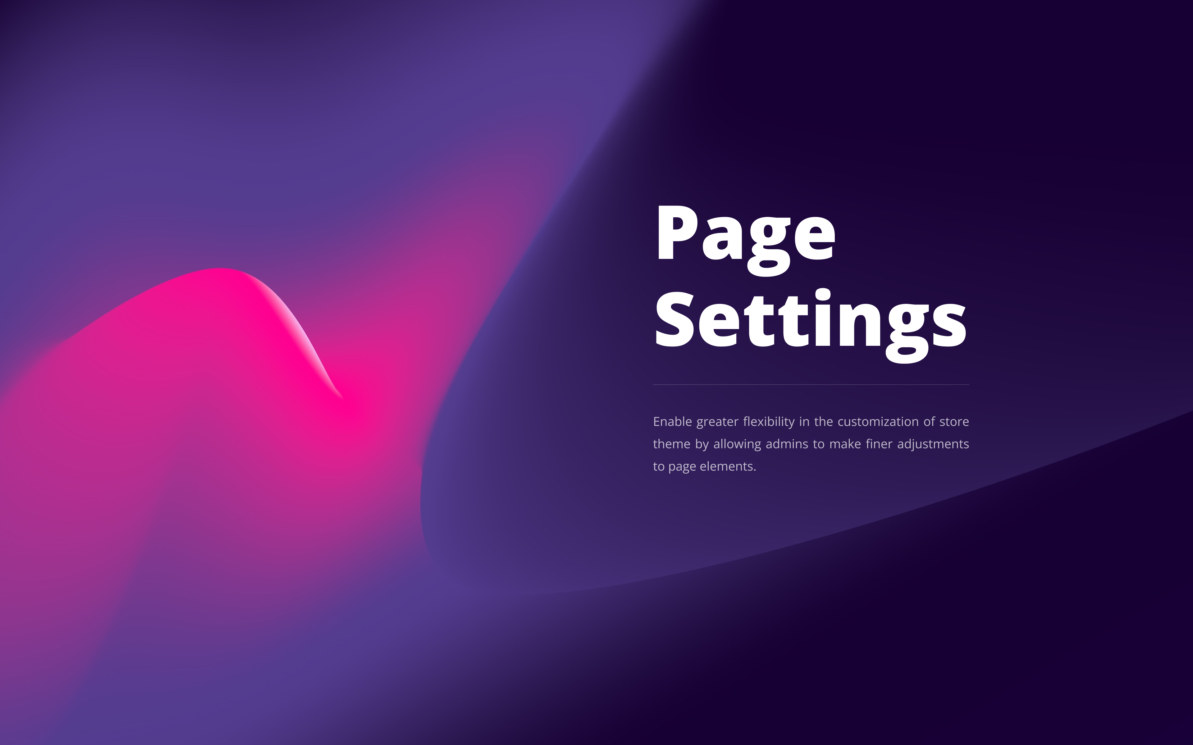
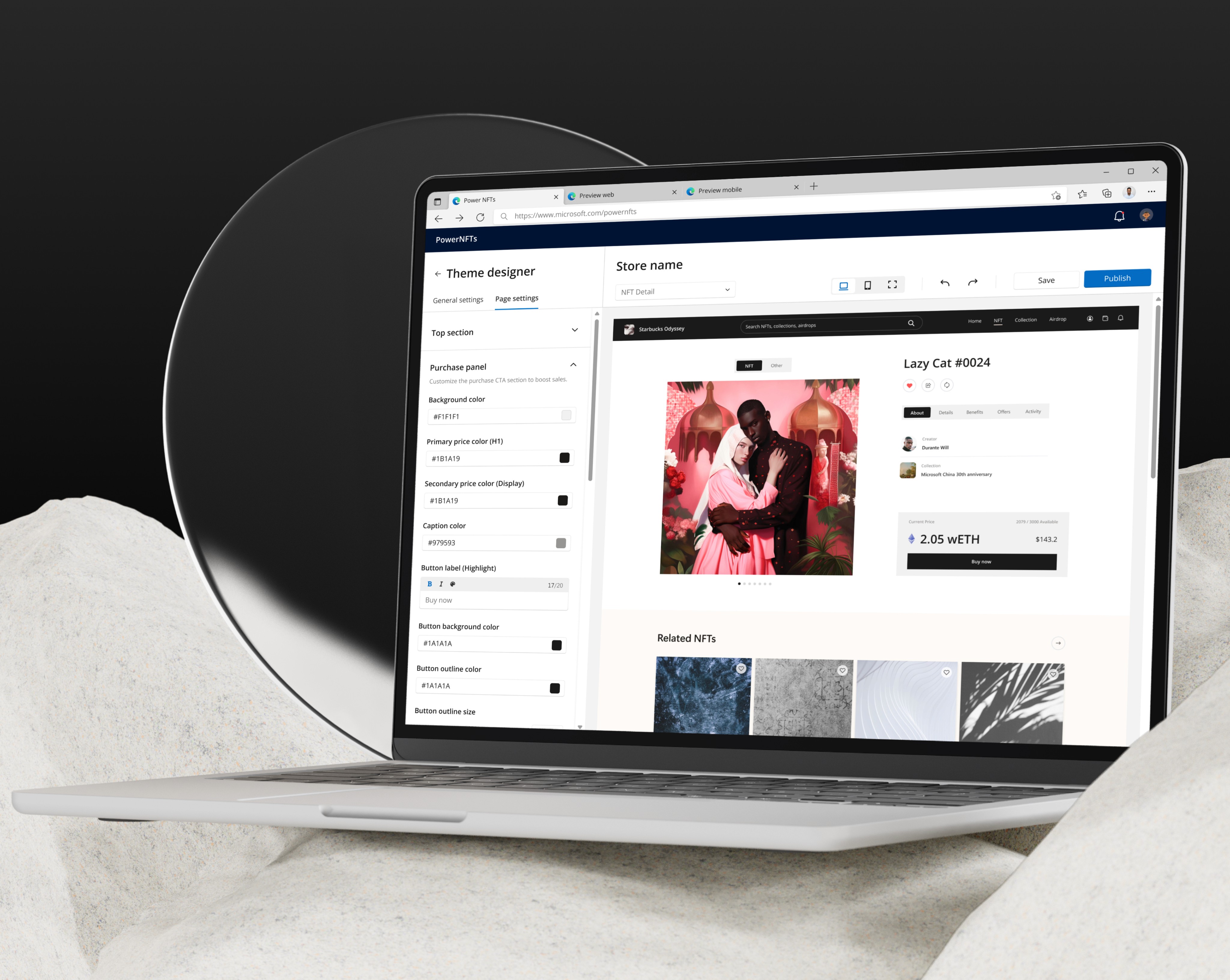
Page settings
Page settings

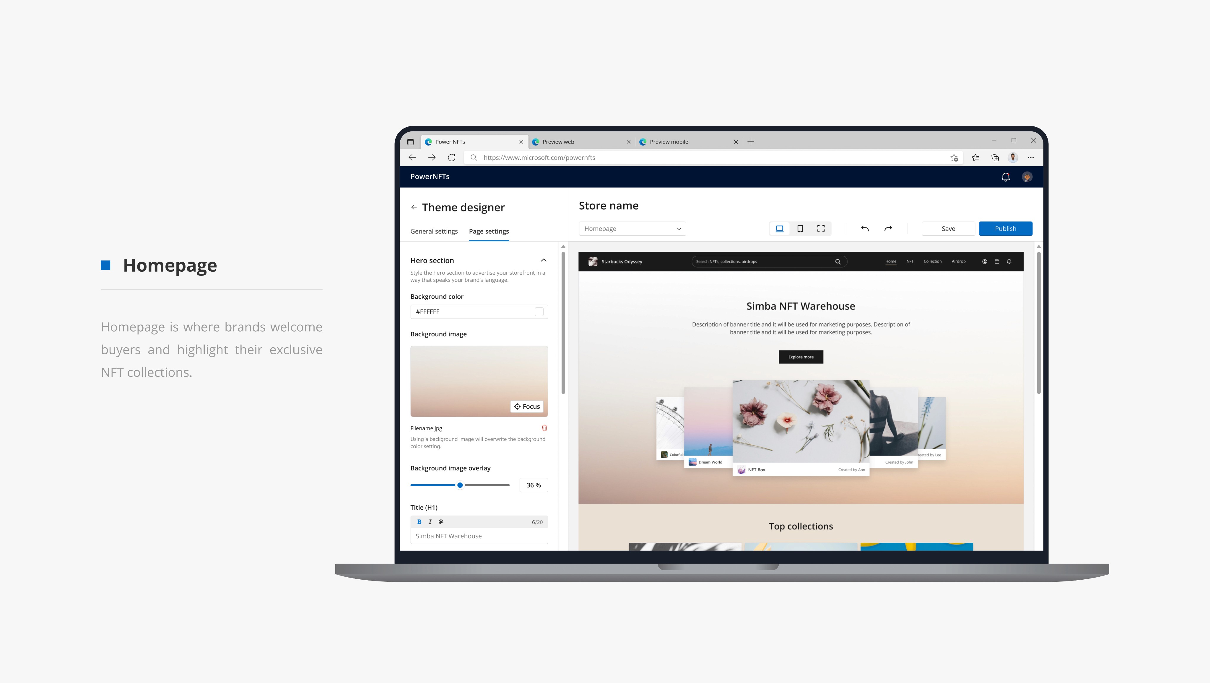
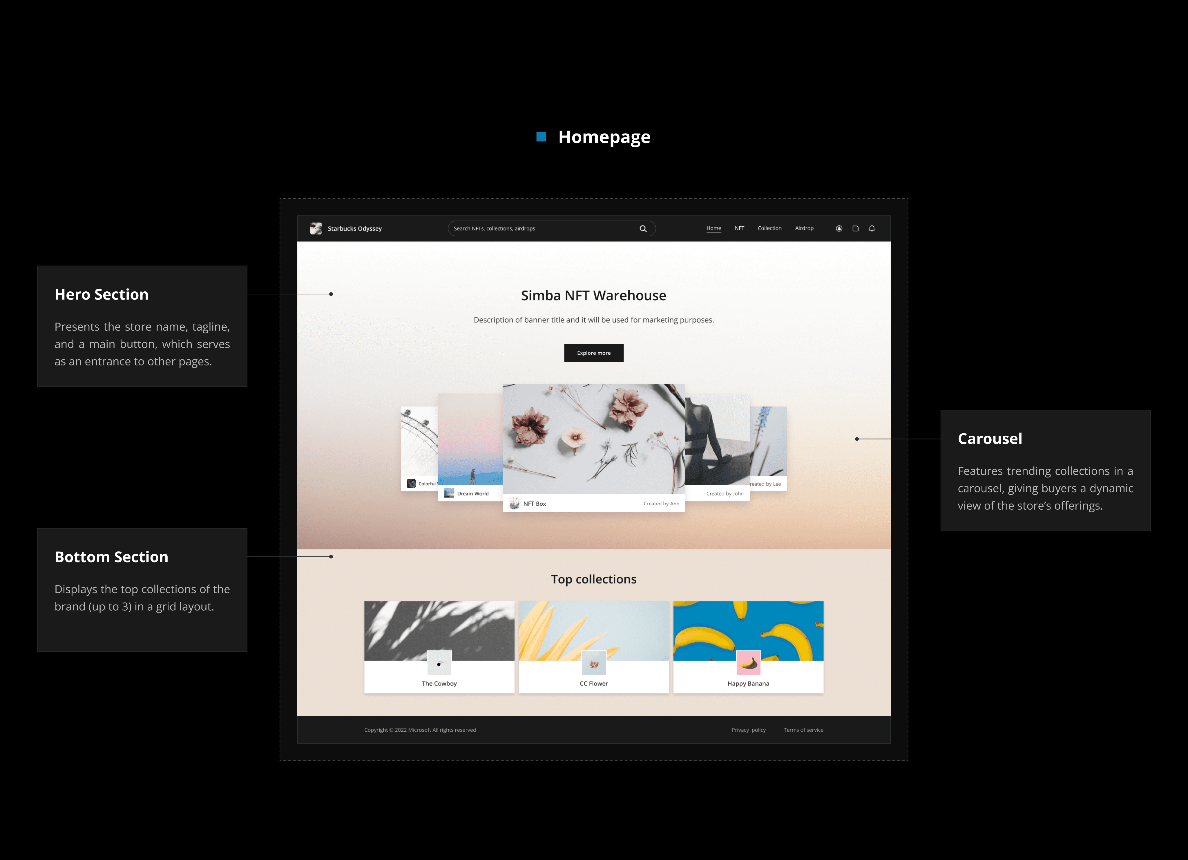
Homepage
Homepage
Carousel Settings
Carousel Settings
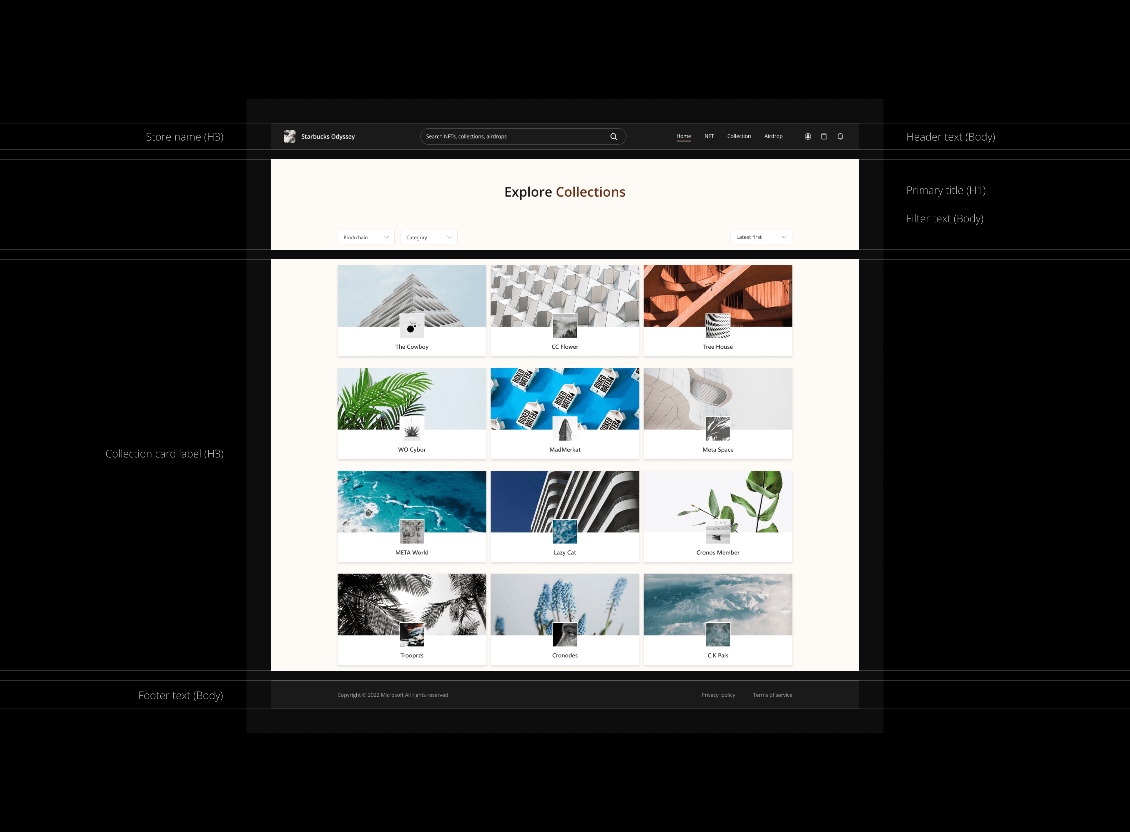
Top collection
Top collection
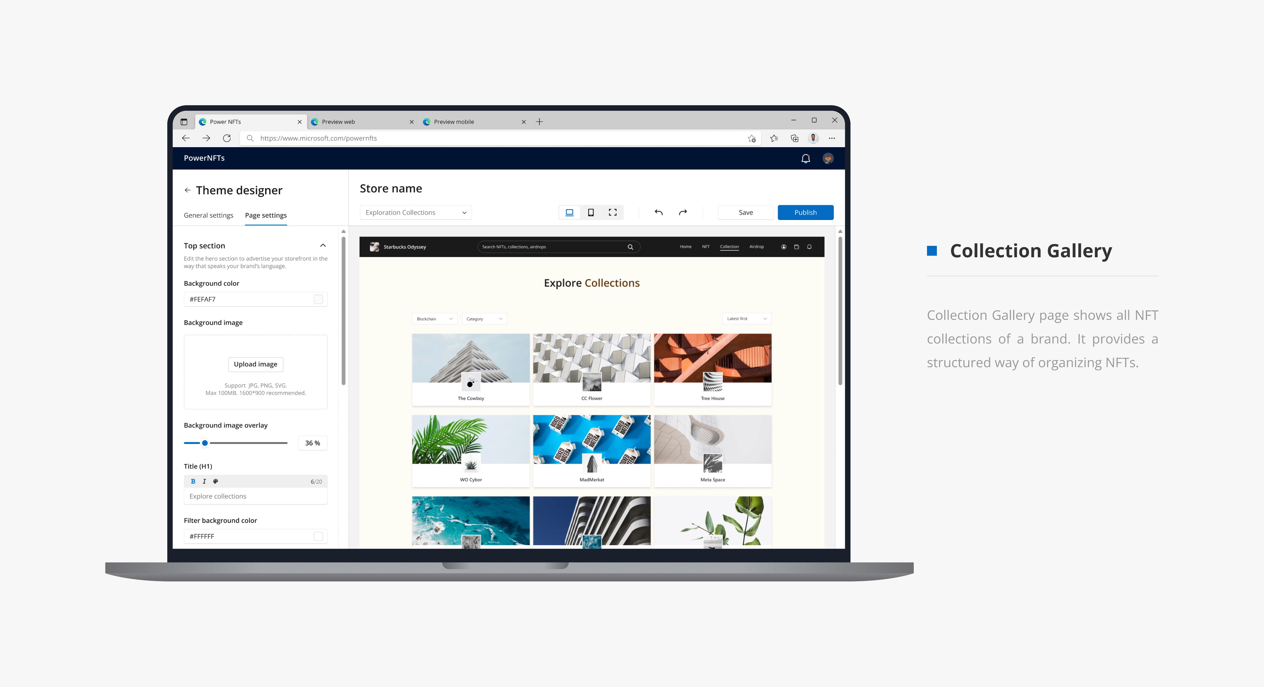
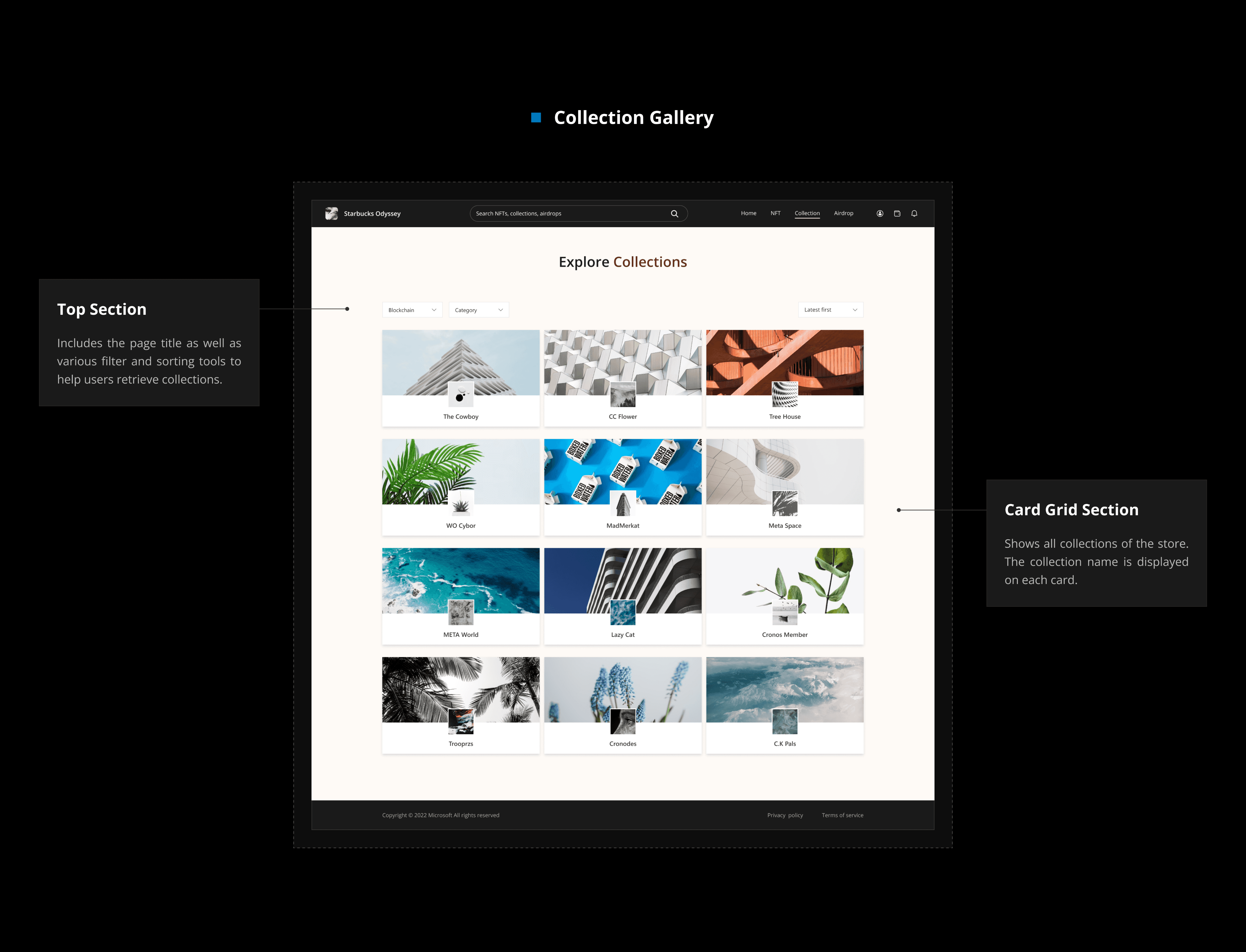
Collection Gallery
Collection Gallery
Background
Text Editor
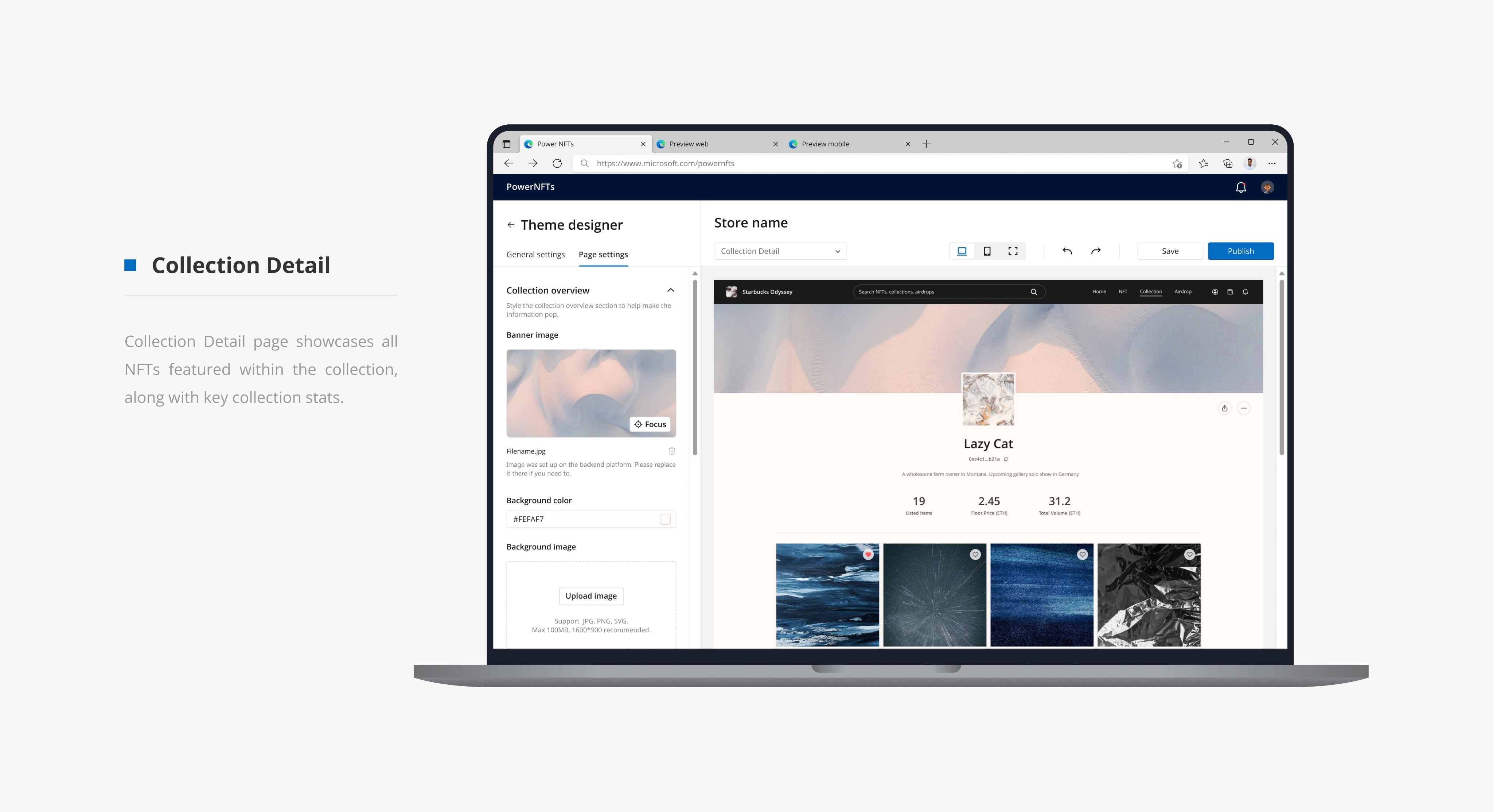
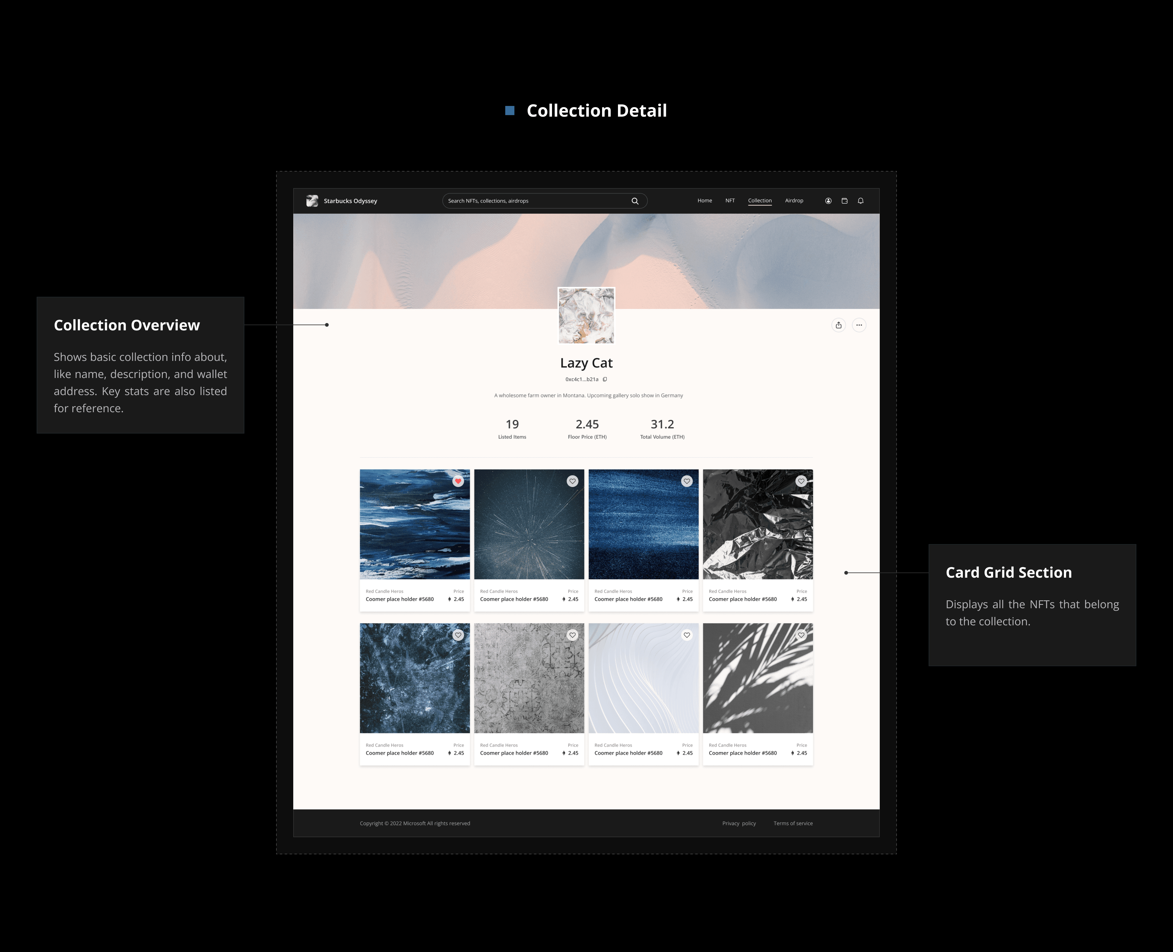
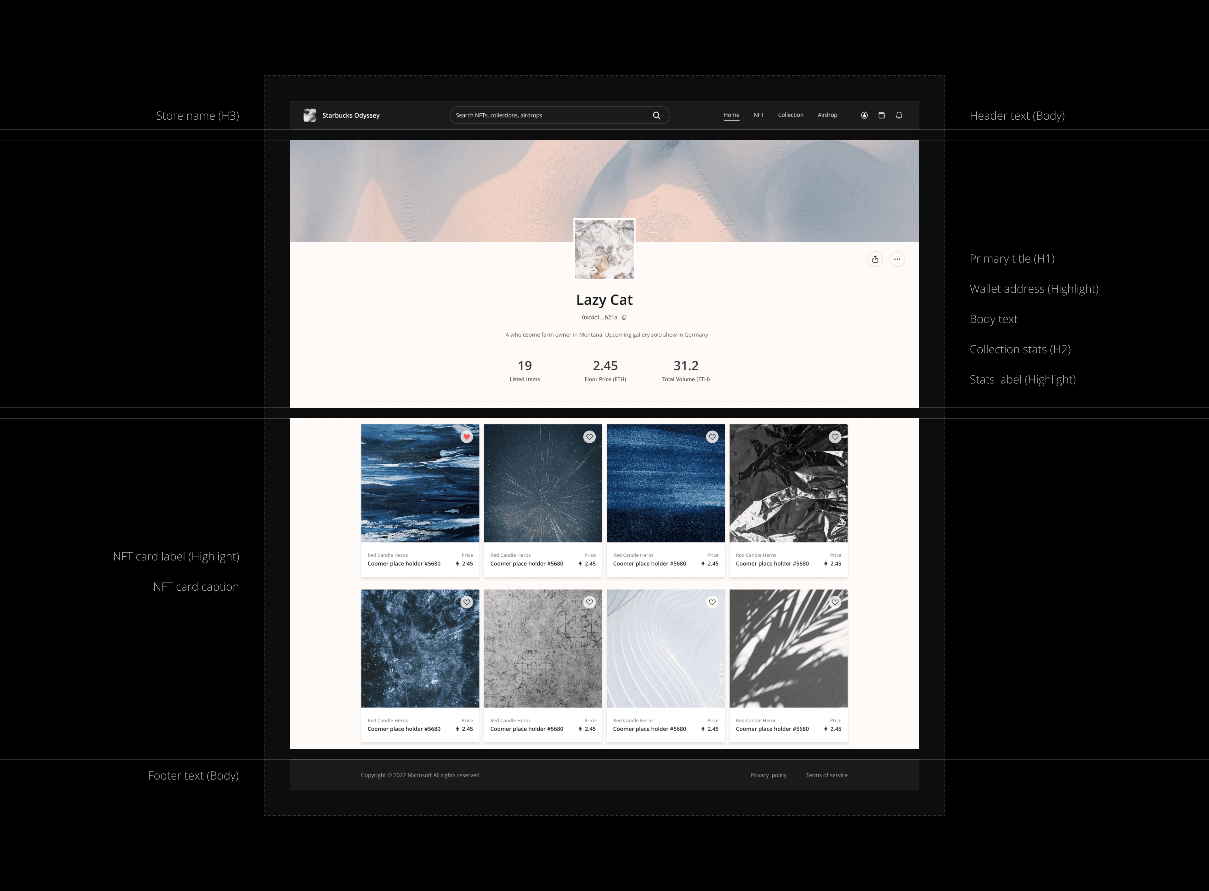
Collection Detail
Collection Detail
Text Color settings
Text Color settings
Icon Settings
Icon Settings
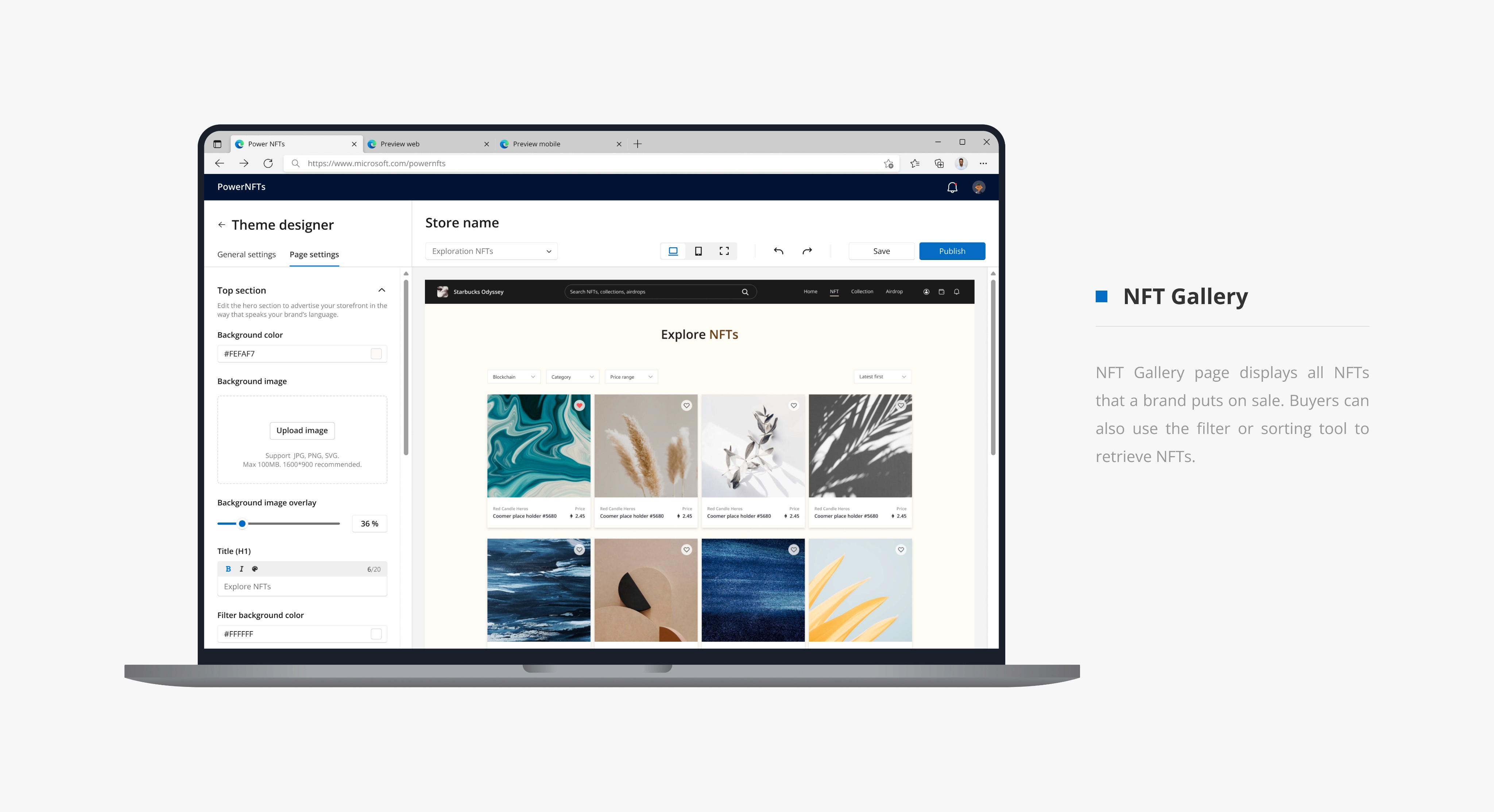
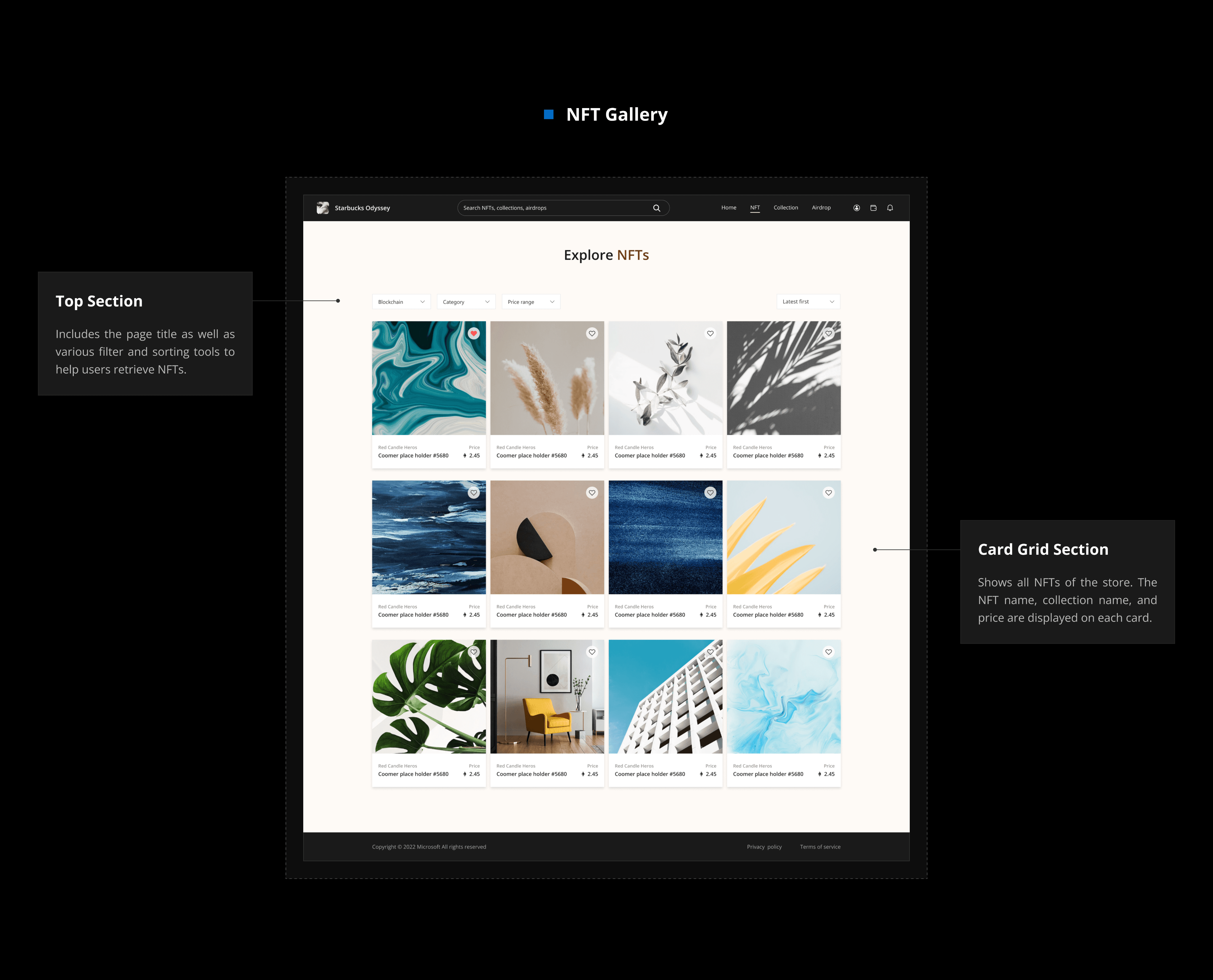
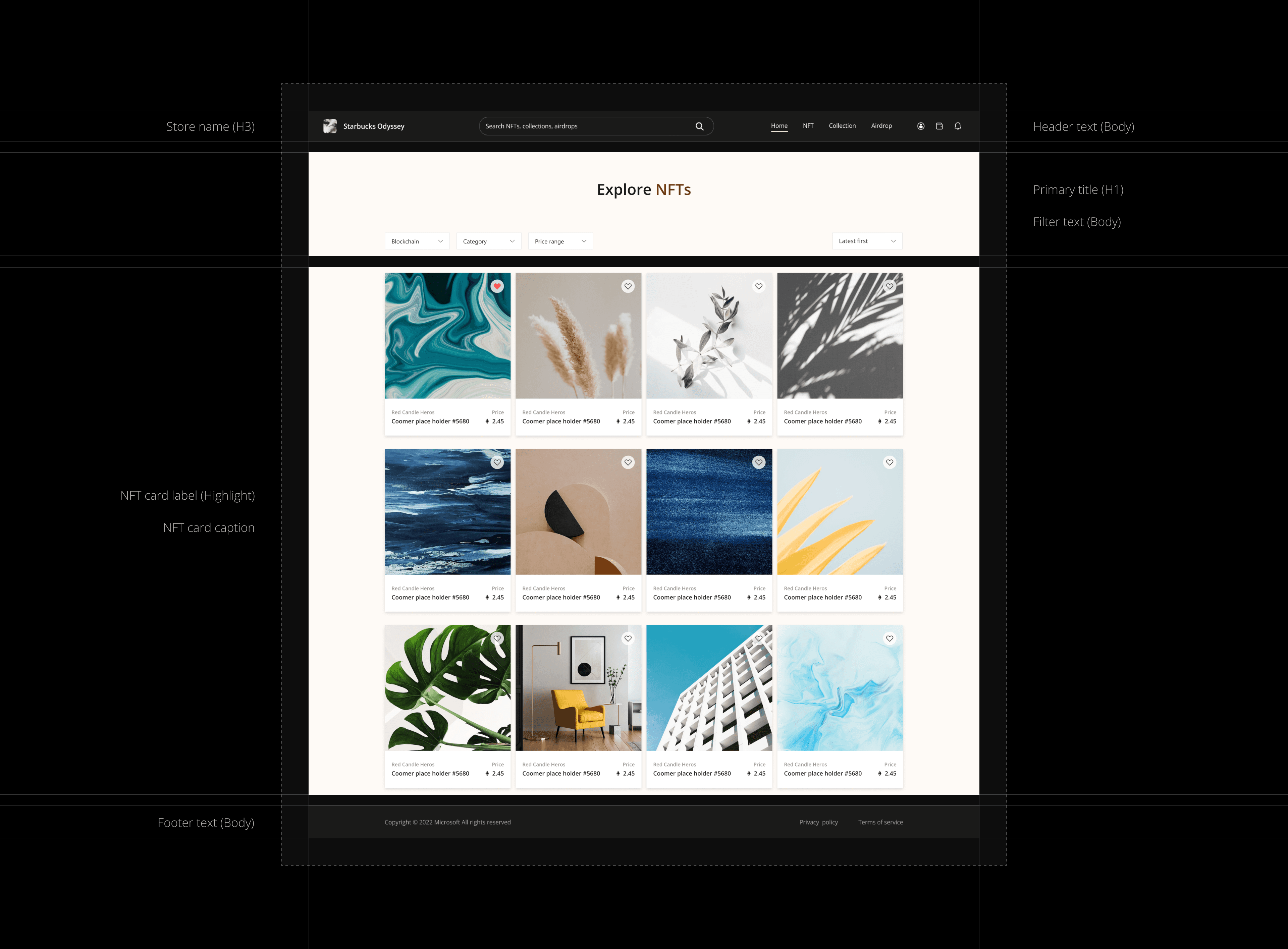
NFT Gallery
NFT Gallery
Filter Settings
Filter Settings
Card Grid Layout
Card Grid Layout
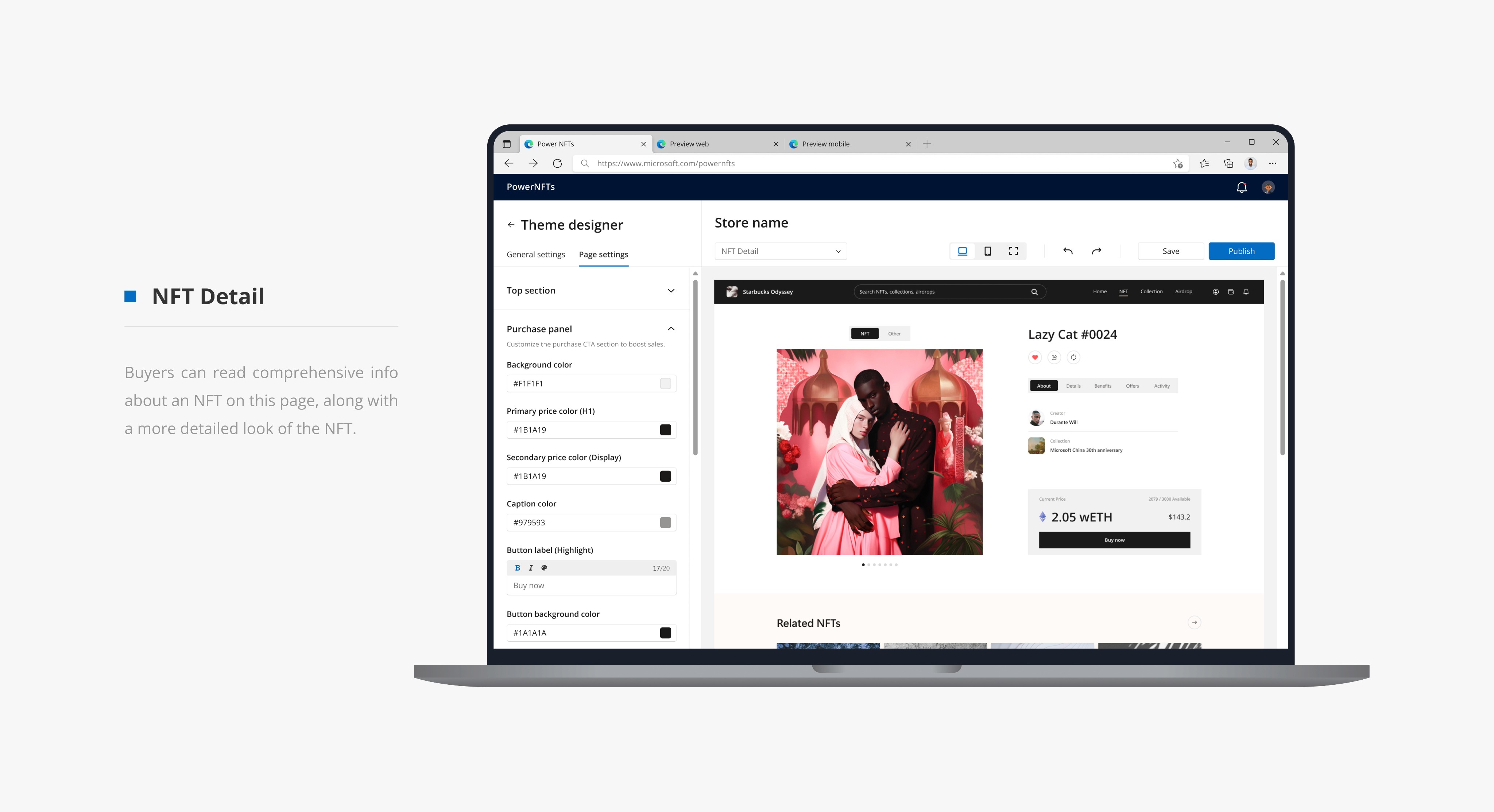
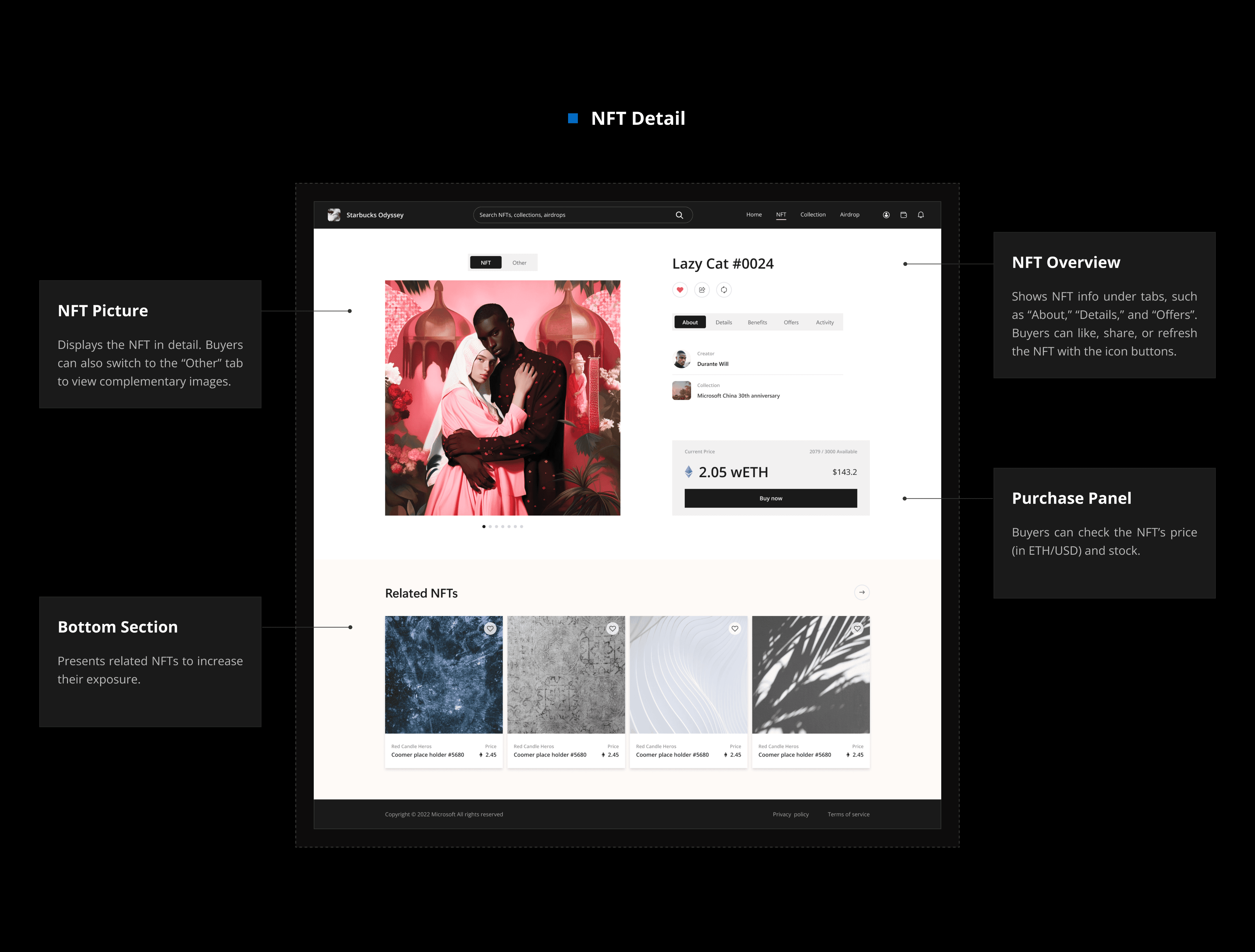
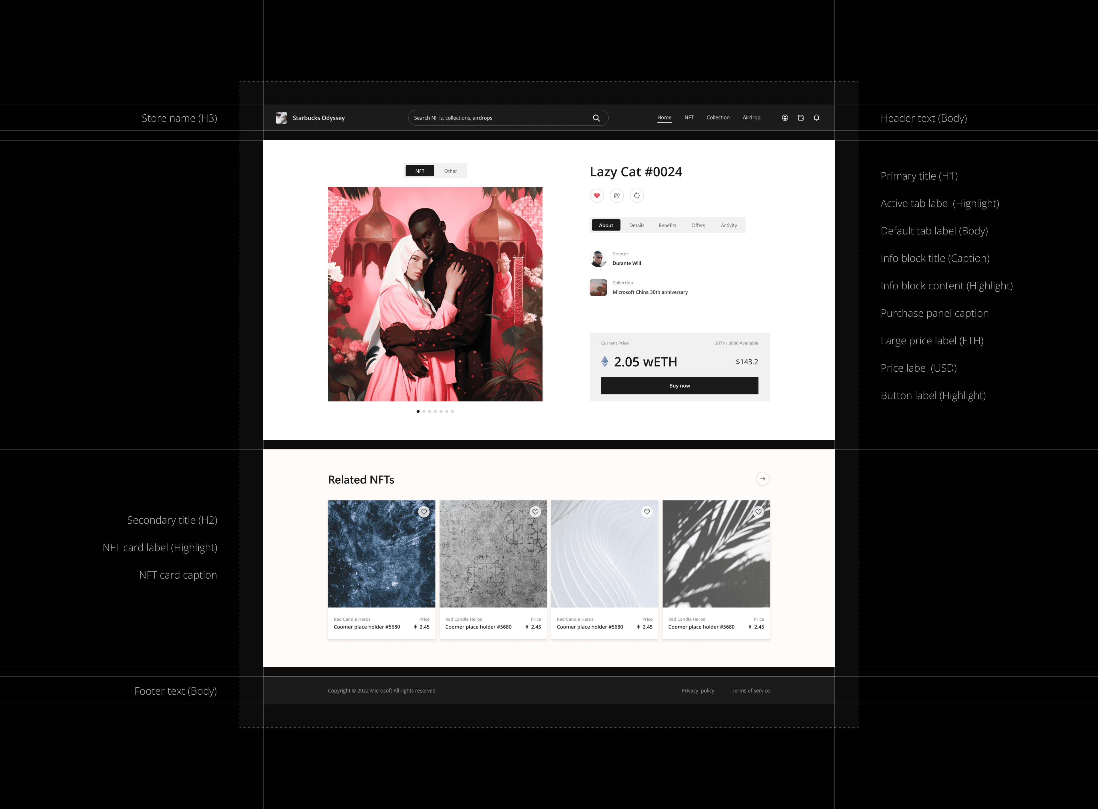
NFT Detail
NFT Detail
Tab Settings
Tab Settings
Button settings
Button settings
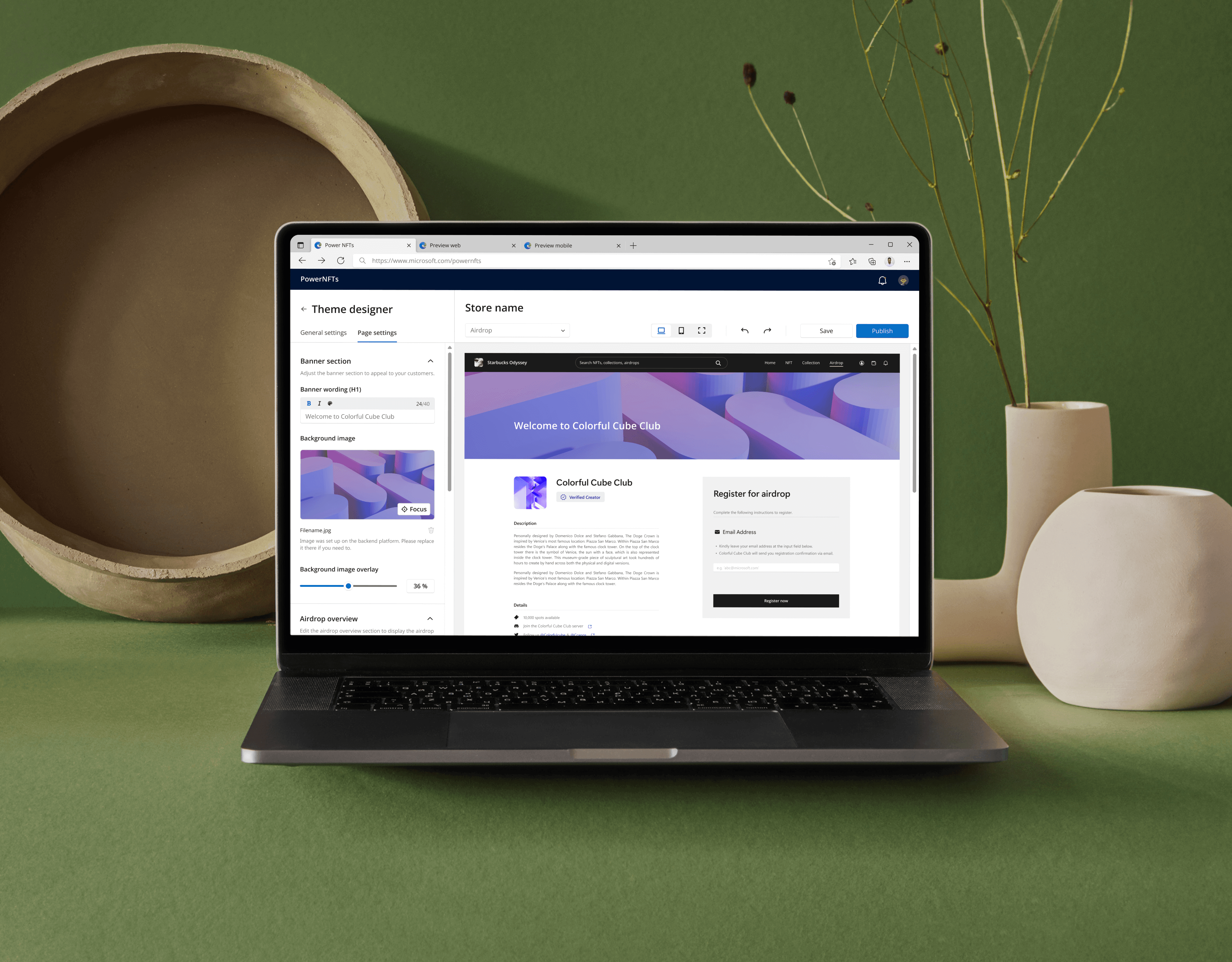
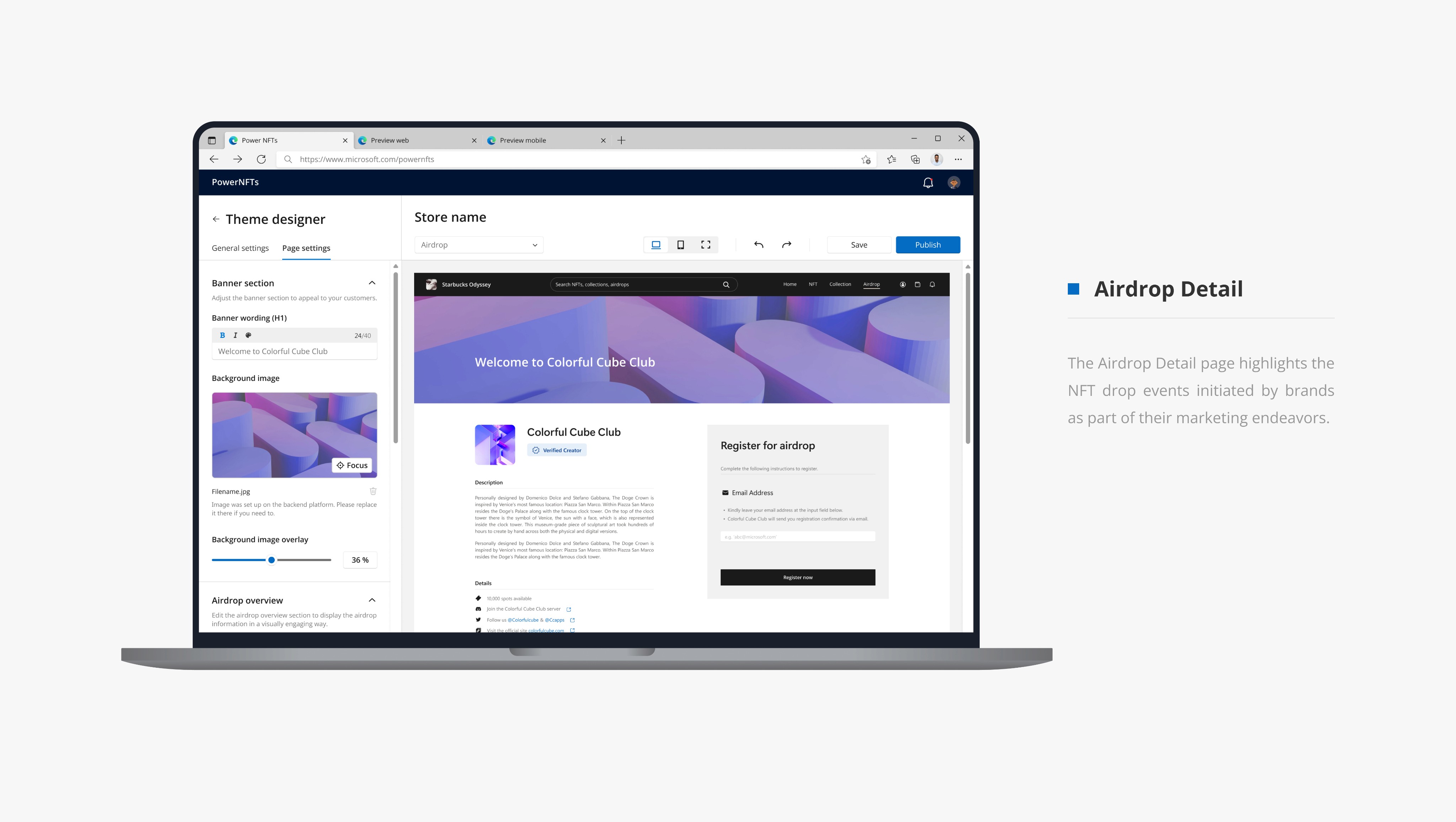
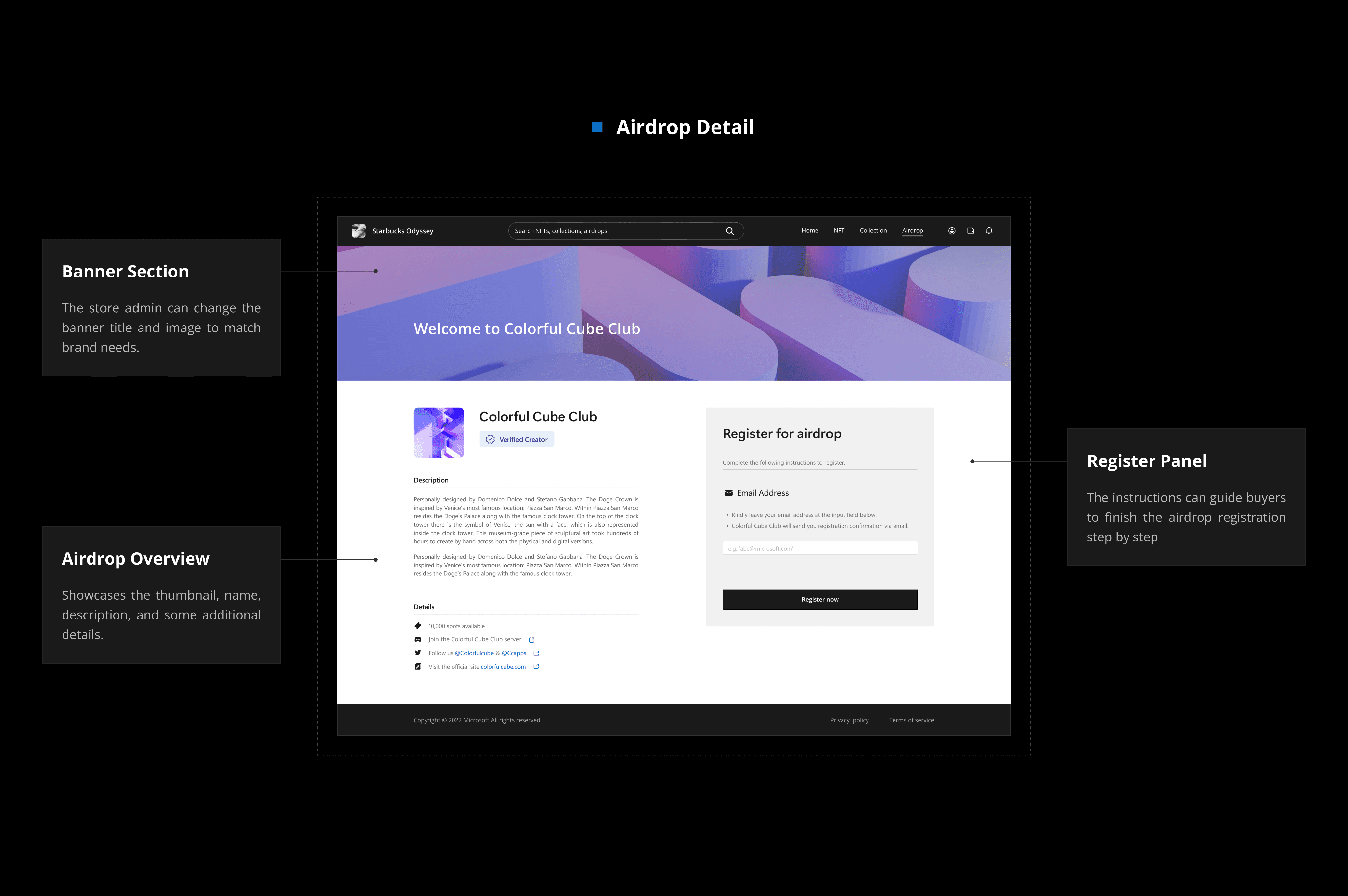
Airdrop Detail
Airdrop Detail
Tag settings
Tag settings
Image Focal Point
Image Focal Point
09
09
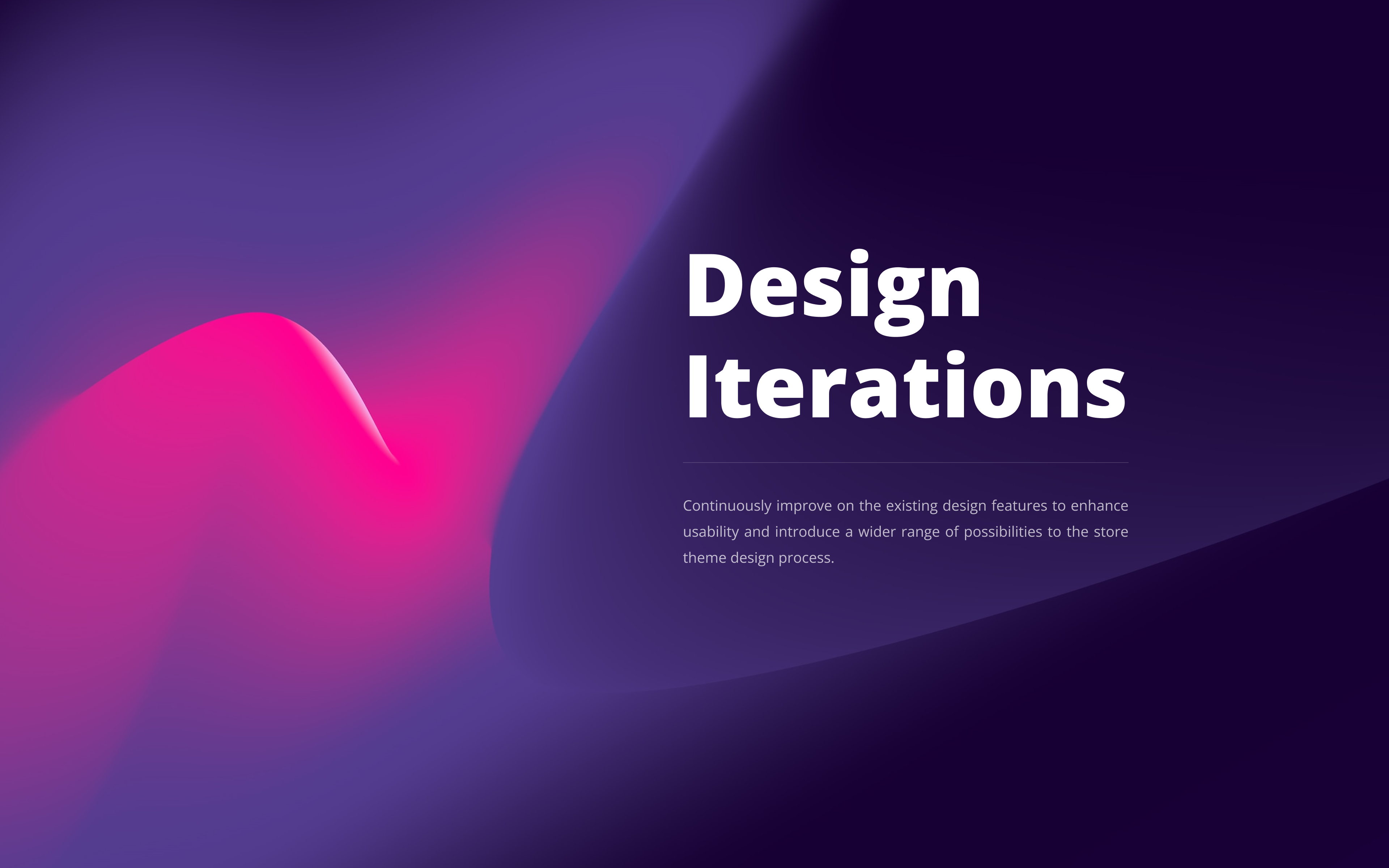
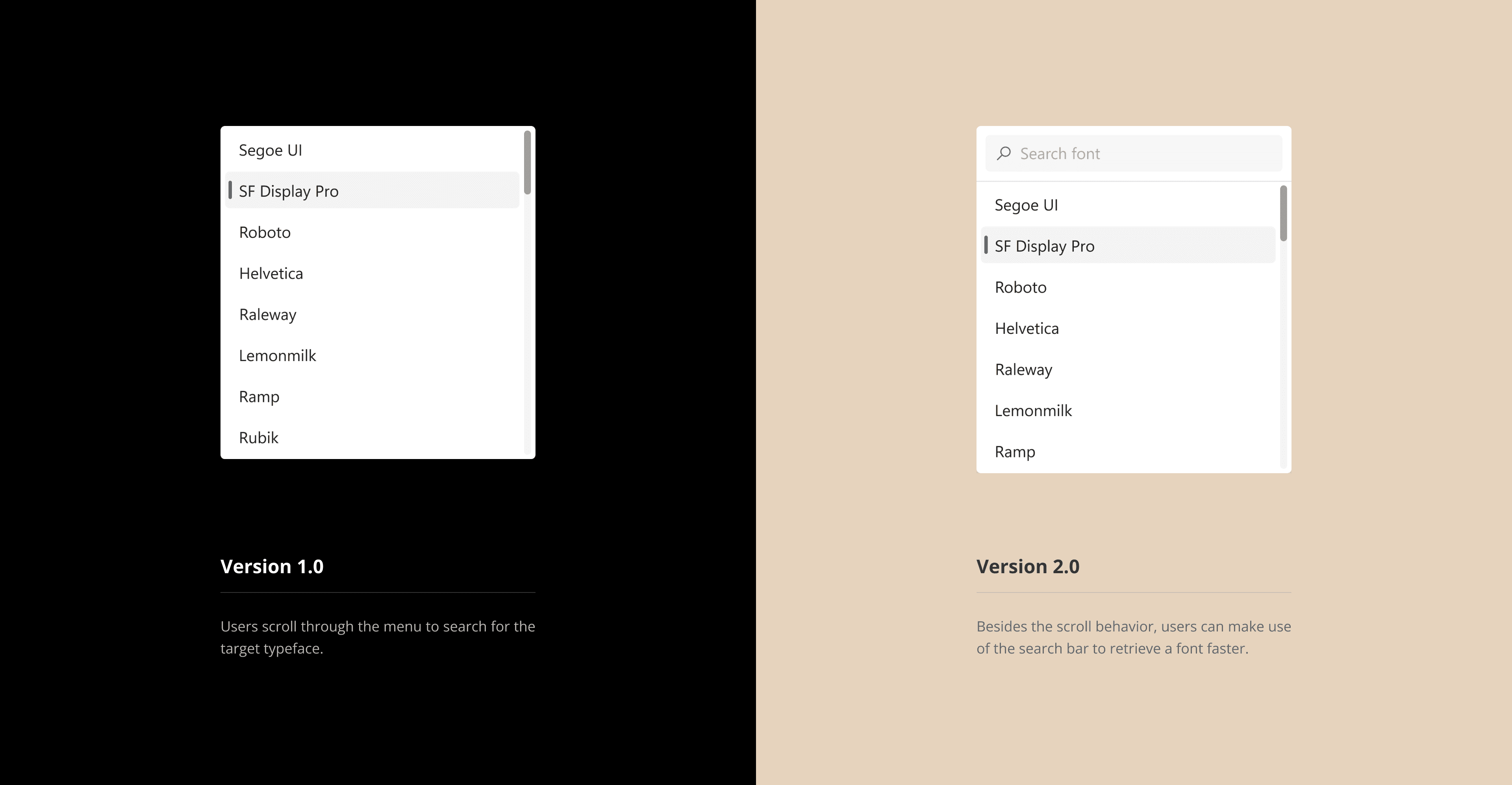
Design Iterations
Design Iterations
Font Selector
Font Selector
Collection menu
Collection menu
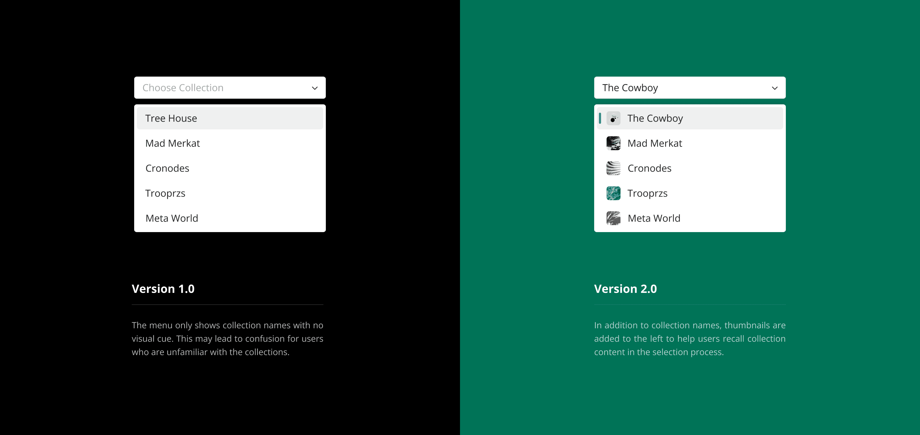
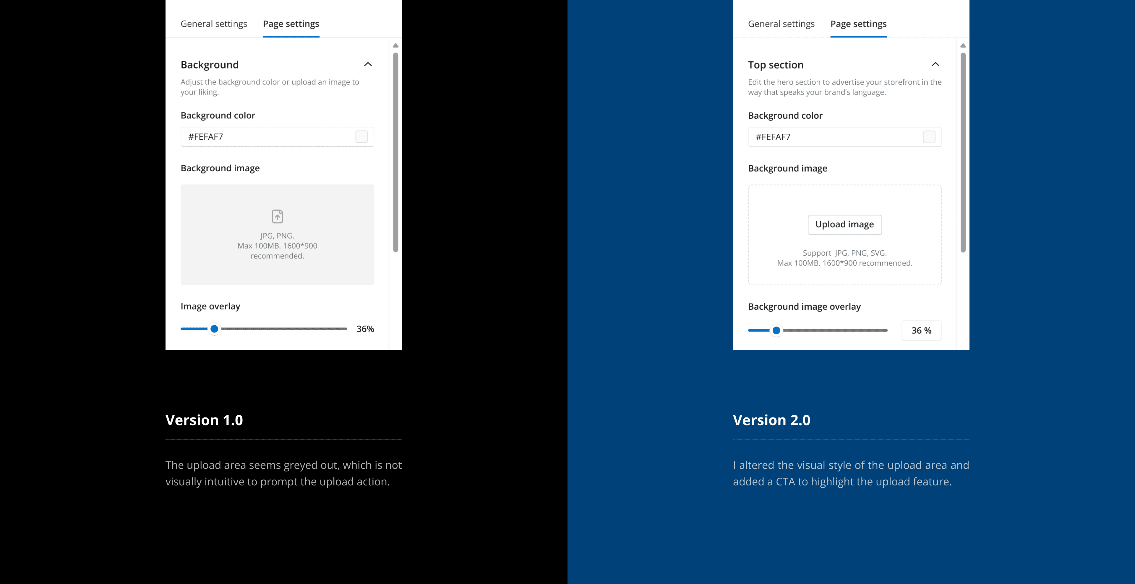
Image Upload
Image Upload
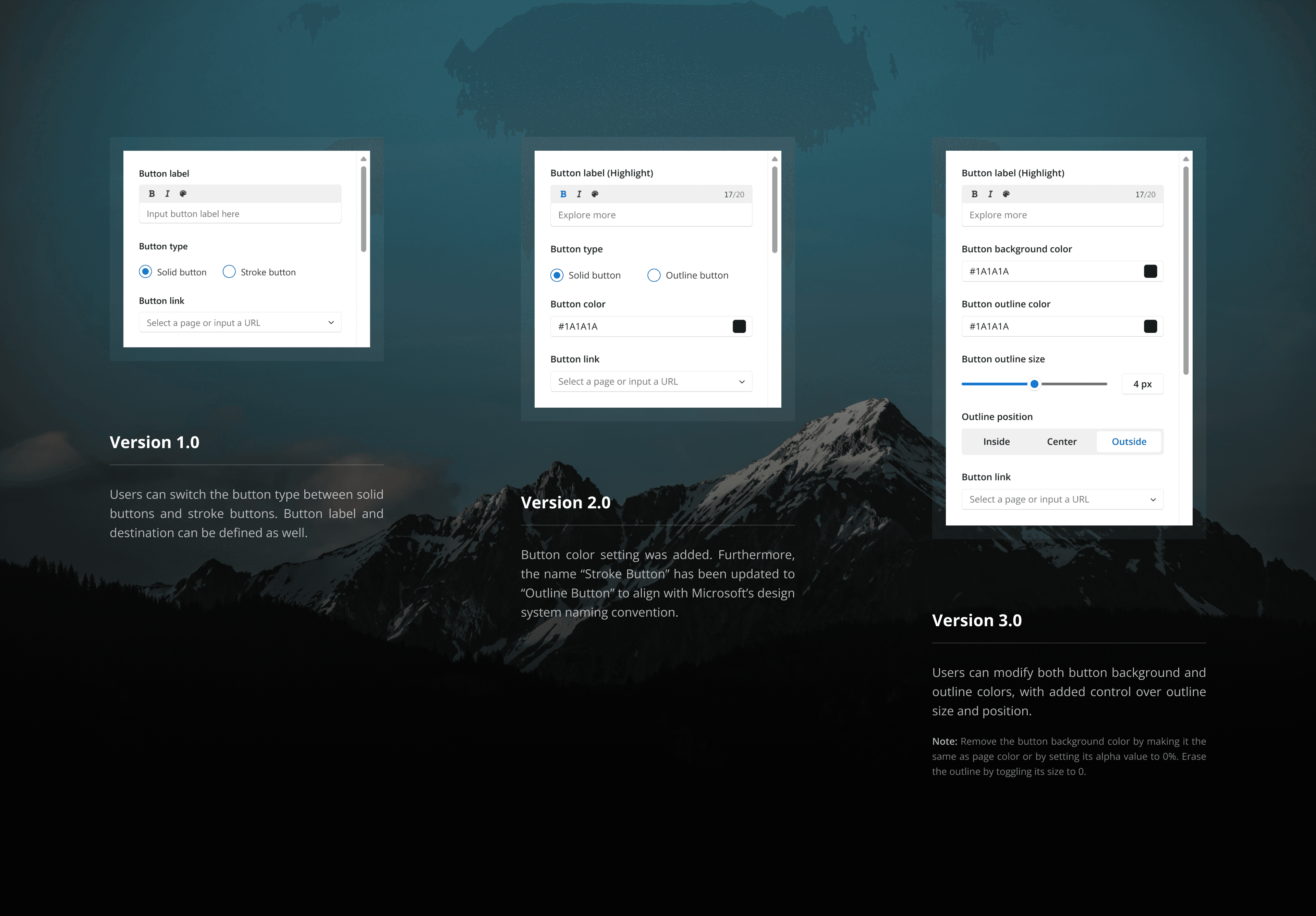
Button Settings
Button Settings
Top Bar Settings
Top Bar Settings
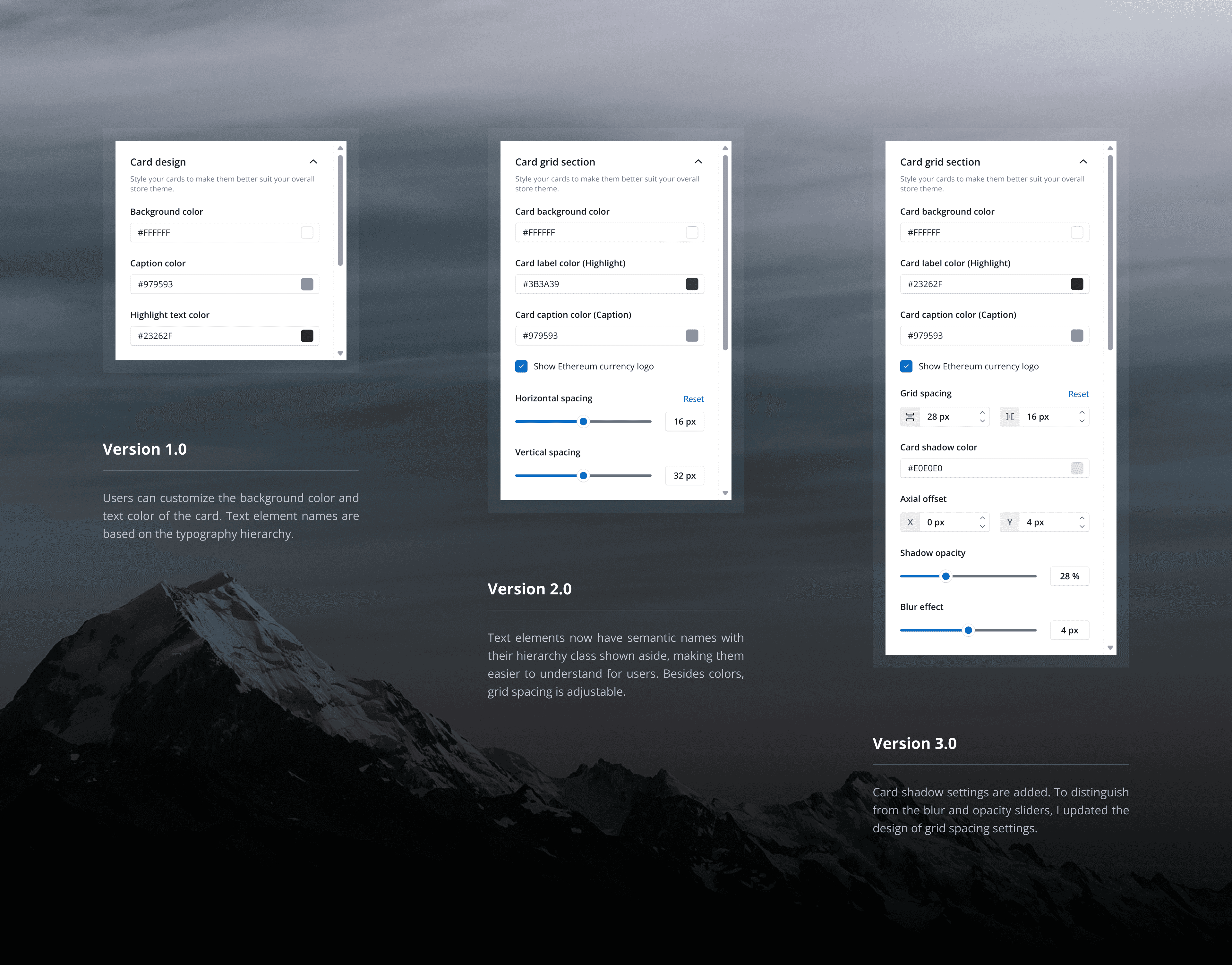
Card Grid Settings
Card Grid Settings
10
10
Project Takeaways
Project Takeaways
Glimpse into Web3
Glimpse into Web3
Design within System
Design within System
11
11
Hifi Prototypes
Hifi Prototypes
Thank you for stopping by.
Previous
UP next

