


1 Week
UX Designer
Xi pang
UX, Mobile Design
Figma
I completed this series of design challenges for Microsoft China. There were 2 design tasks in total. One was to redesign the celebrity search pages of Microsoft Bing. Another was to redesign the weather search pages on Bing. Due to the time limit, I strived to finish the research and design from scratch in 4-5 days.
Throughout the process, I was solely in charge of the design and research work. For the research part, I applied different kinds of methods in each task, like competitor analysis or task analysis. For the design part, I first drew simple sketches to explore the layout. Following that, I created hifi prototypes with the guidance of the sketches and some other visual references found online.
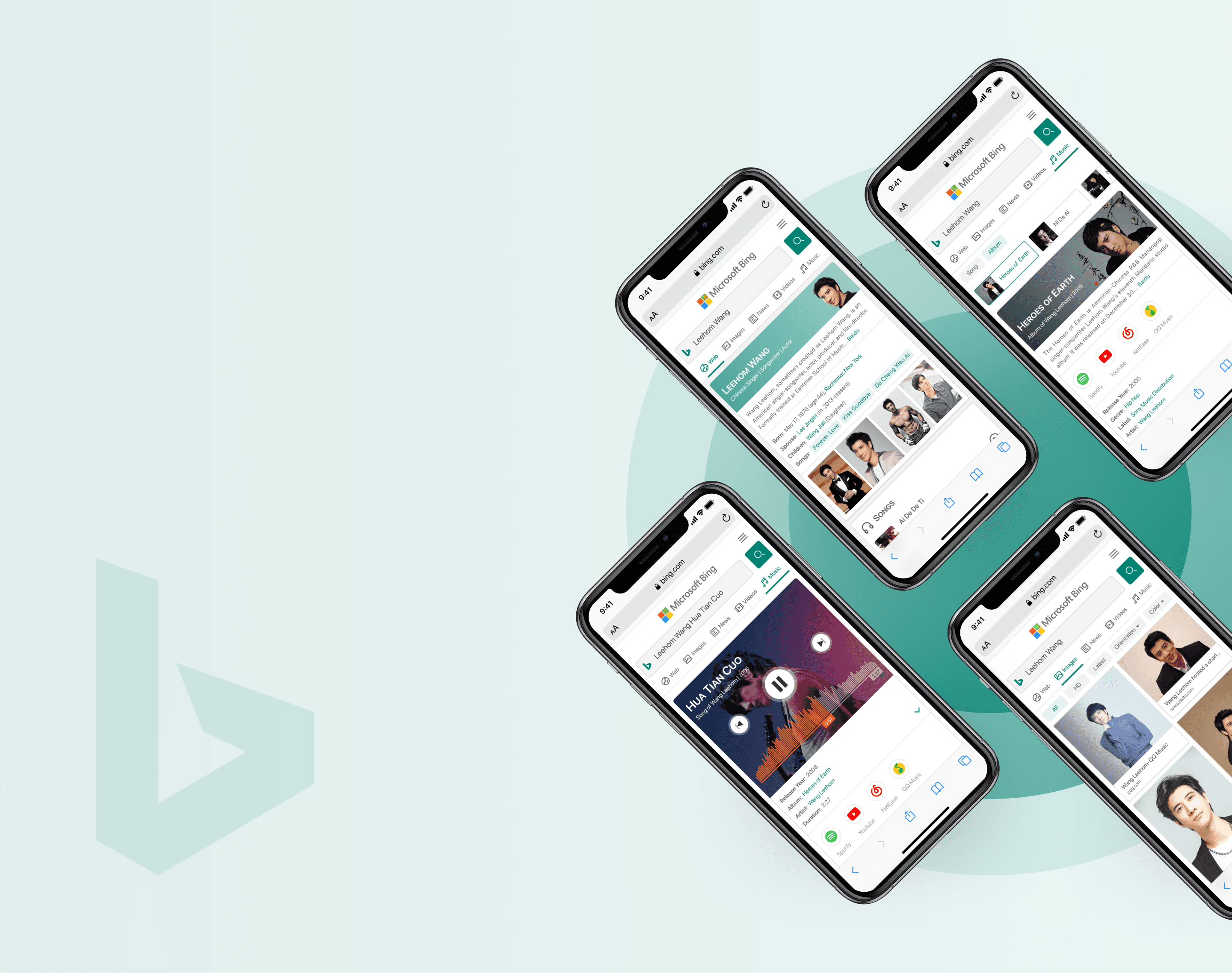

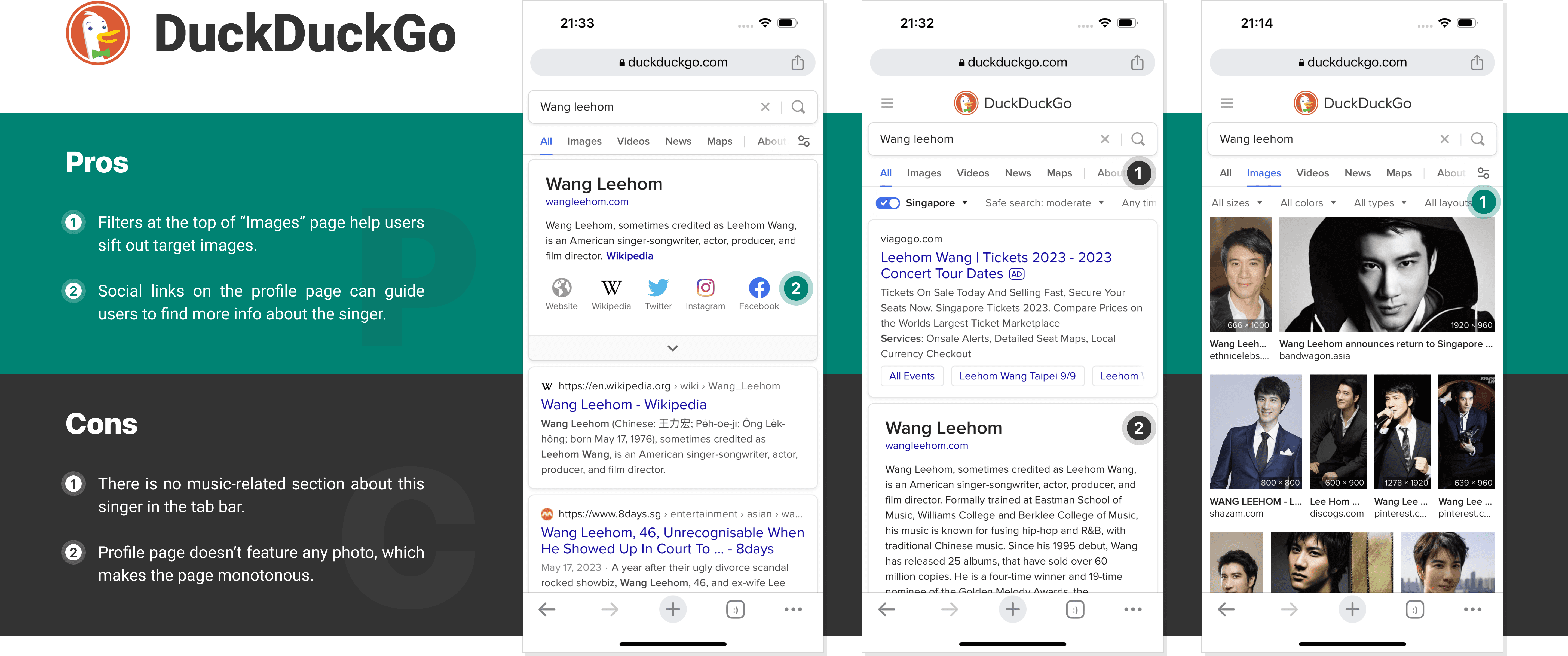
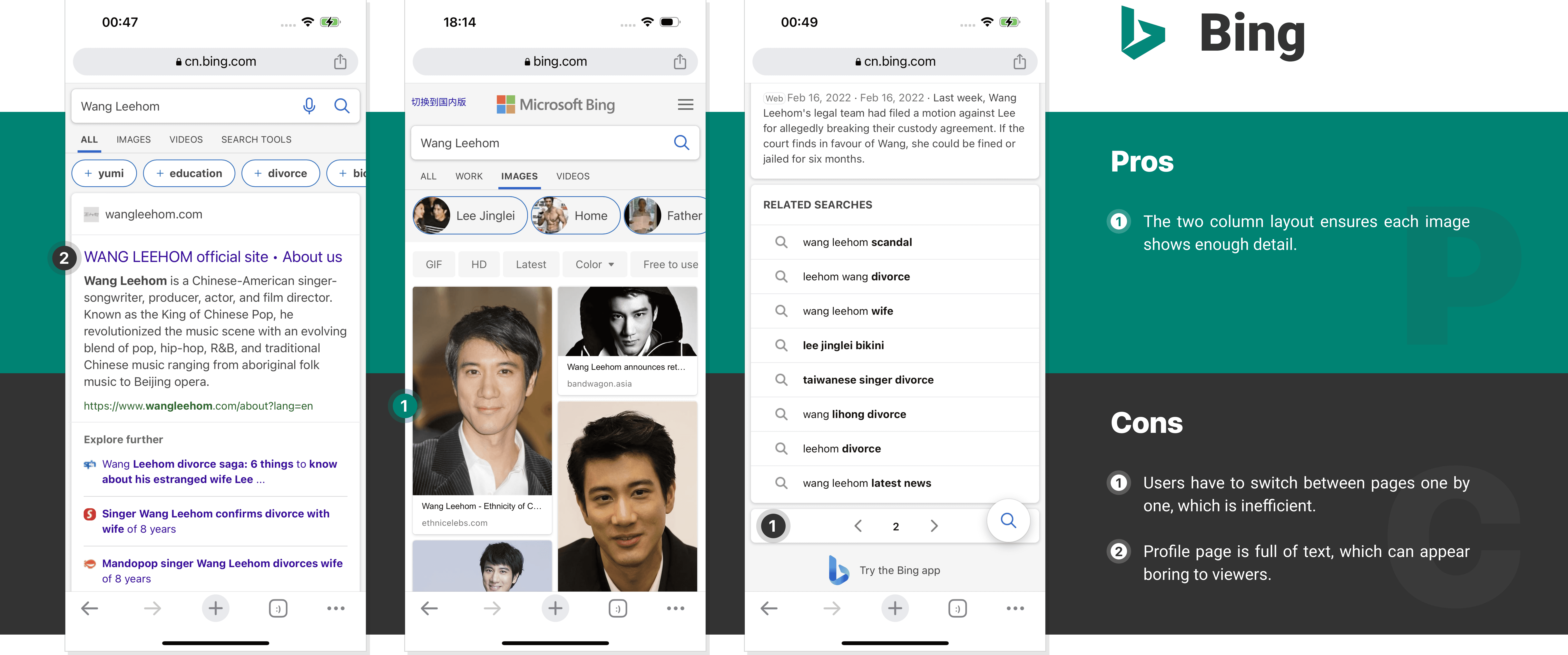
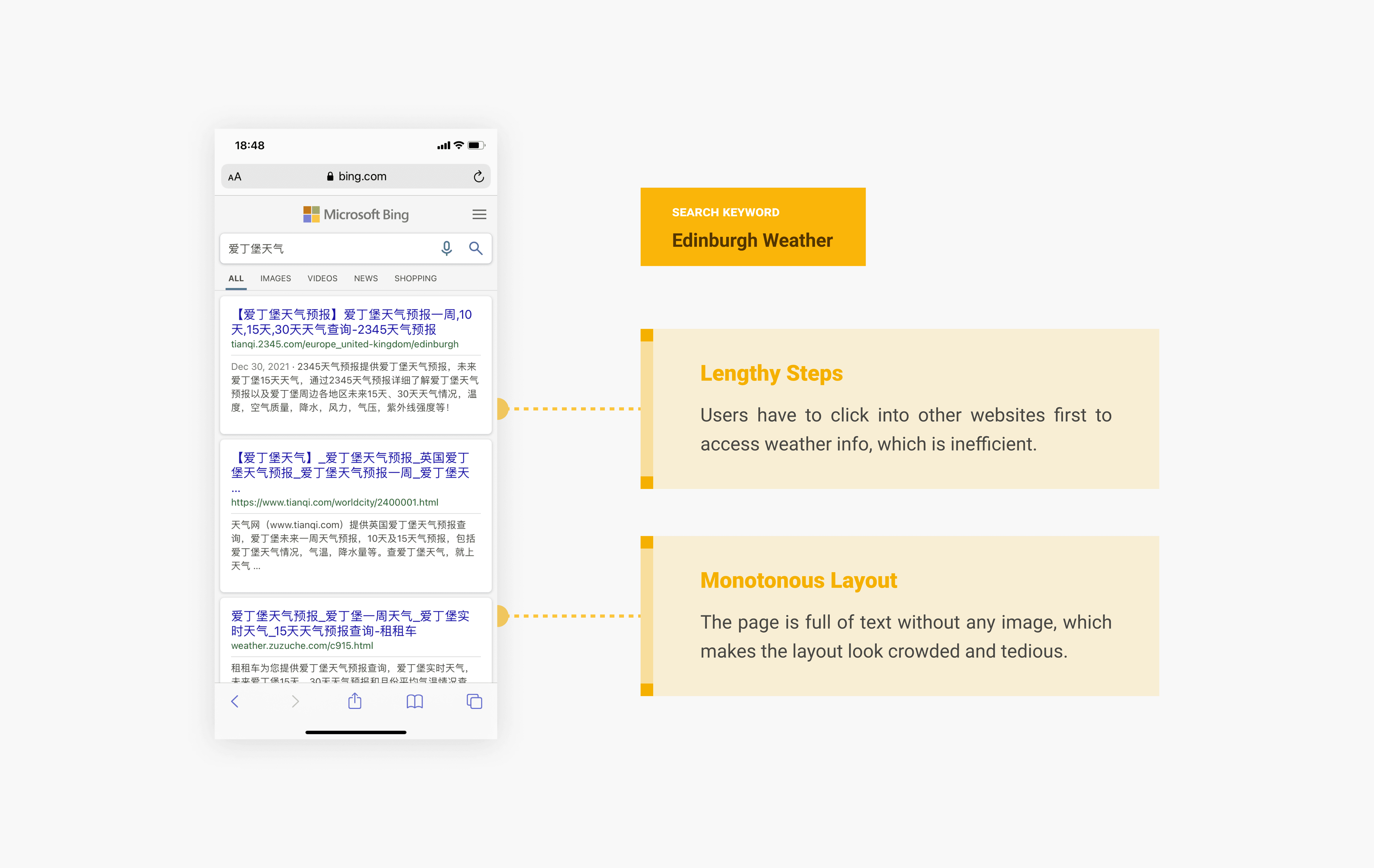
In the first design task, I was asked to design the search result pages for a Chinese singer (Wang Leehom.) Thus, I mainly concentrated on five pages in which people are mostly interested when searching for a singer: “All/Web” (lists comprehensive info about the search target), “News”, “Image”, “Video”, and “Music.” After that, I went ahead to analyze potential user tasks and interactions on those pages.

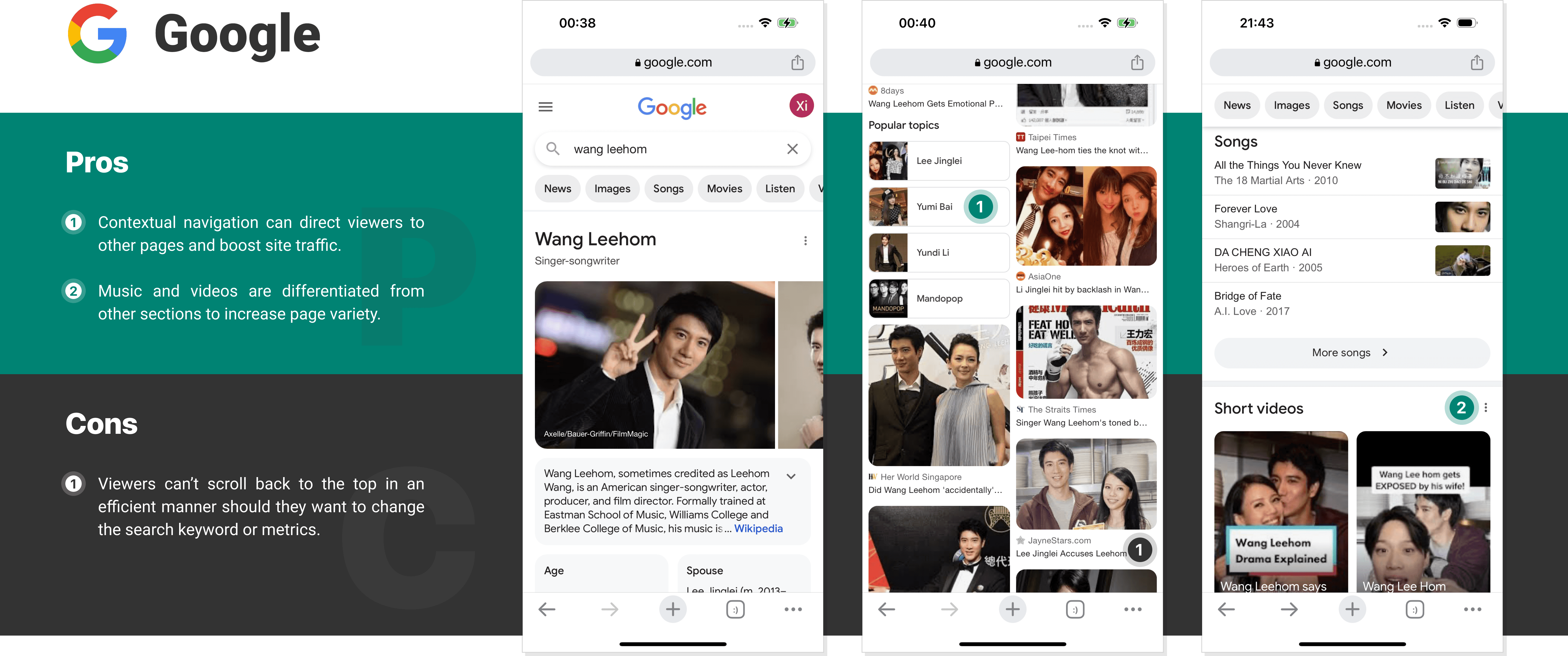
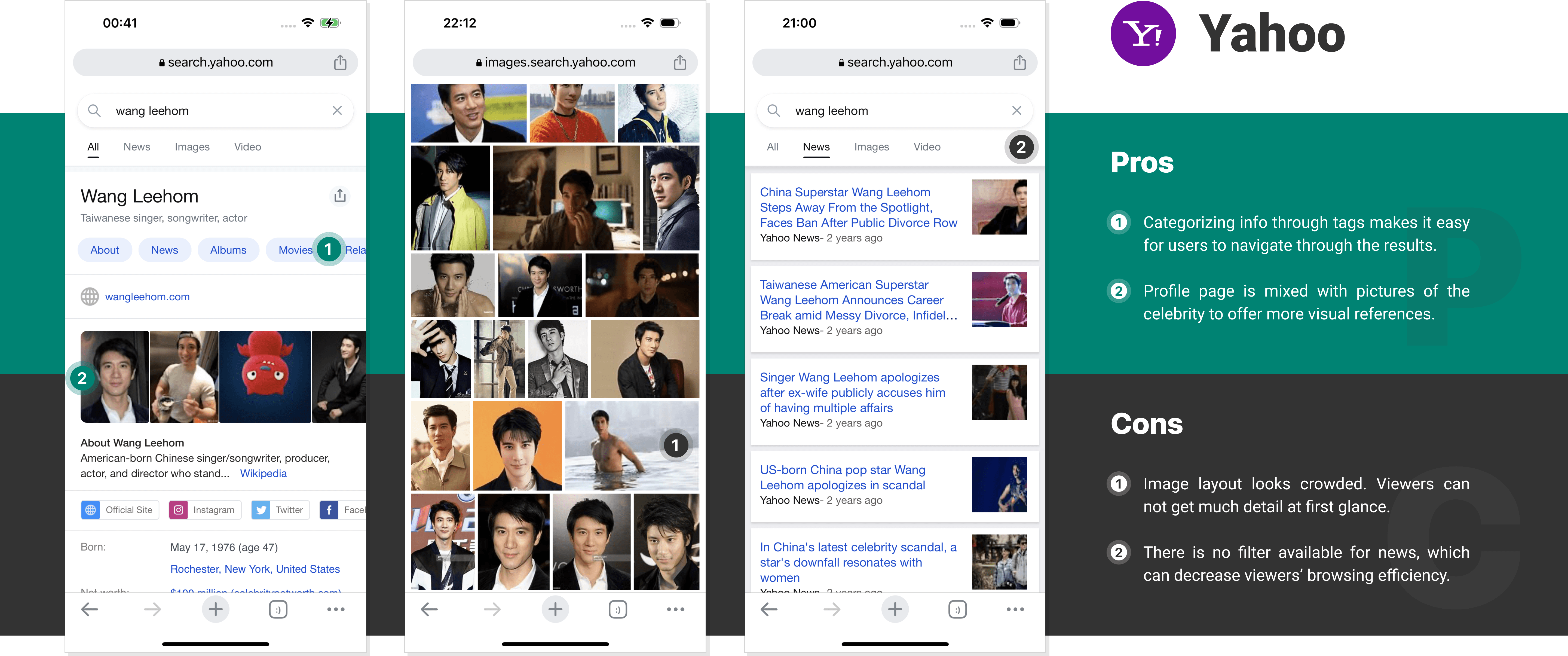
To further acquaint myself with search page design and find inspiration from others, I continued my design process with competitor analysis. I chose 4 popular search engines as subjects. During the process, I carefully examined each search engine and focused on their layouts, content, interactions, visual styles, pros and cons.


Based on the analysis, I encapsulated 3 key improvements for design iteration, which are "music redesign," "image addition," and "Pinterest layout" as shown below.

Redesign the music pages so that users can quickly get to know the singer’s works

Add more images to the celebrity’s profile page to make it look more attractive to viewers

Apply the Pinterest layout to show search results instead of switching pages one by one
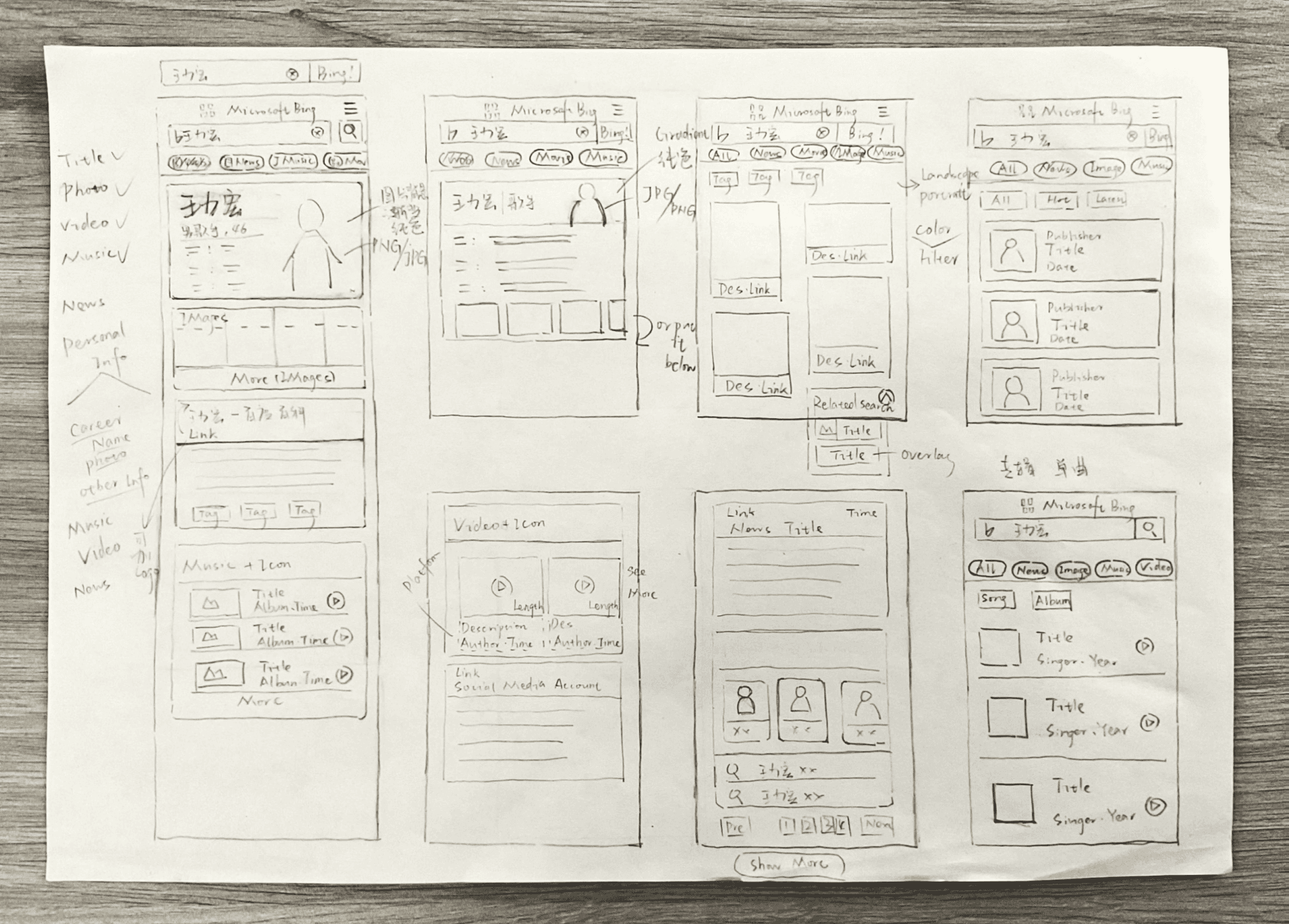
Before I tackled high fidelity design, I first drew some low fidelity sketches. This helped me focus on the design basics, like layout and content, rather than fixating on visual details at the early stage.

Design Showcase
Once I was satisfied with design sketches, I went ahead with high-fidelity prototyping. During the process, I added visual details to the interfaces and created interactions on and between pages.


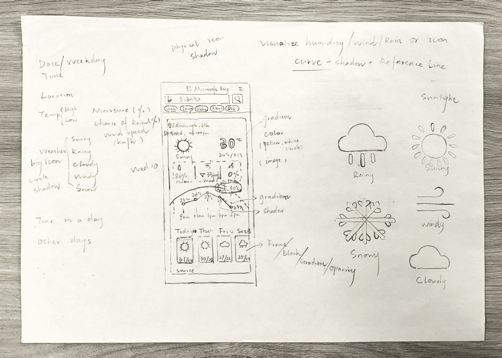

As part of the requirements, I was supposed to design a set of weather icons in conjunction with the interface design. Eventually, I created icons for 5 common types of weather: sunny, cloudy, snowy, windy, and rainy.

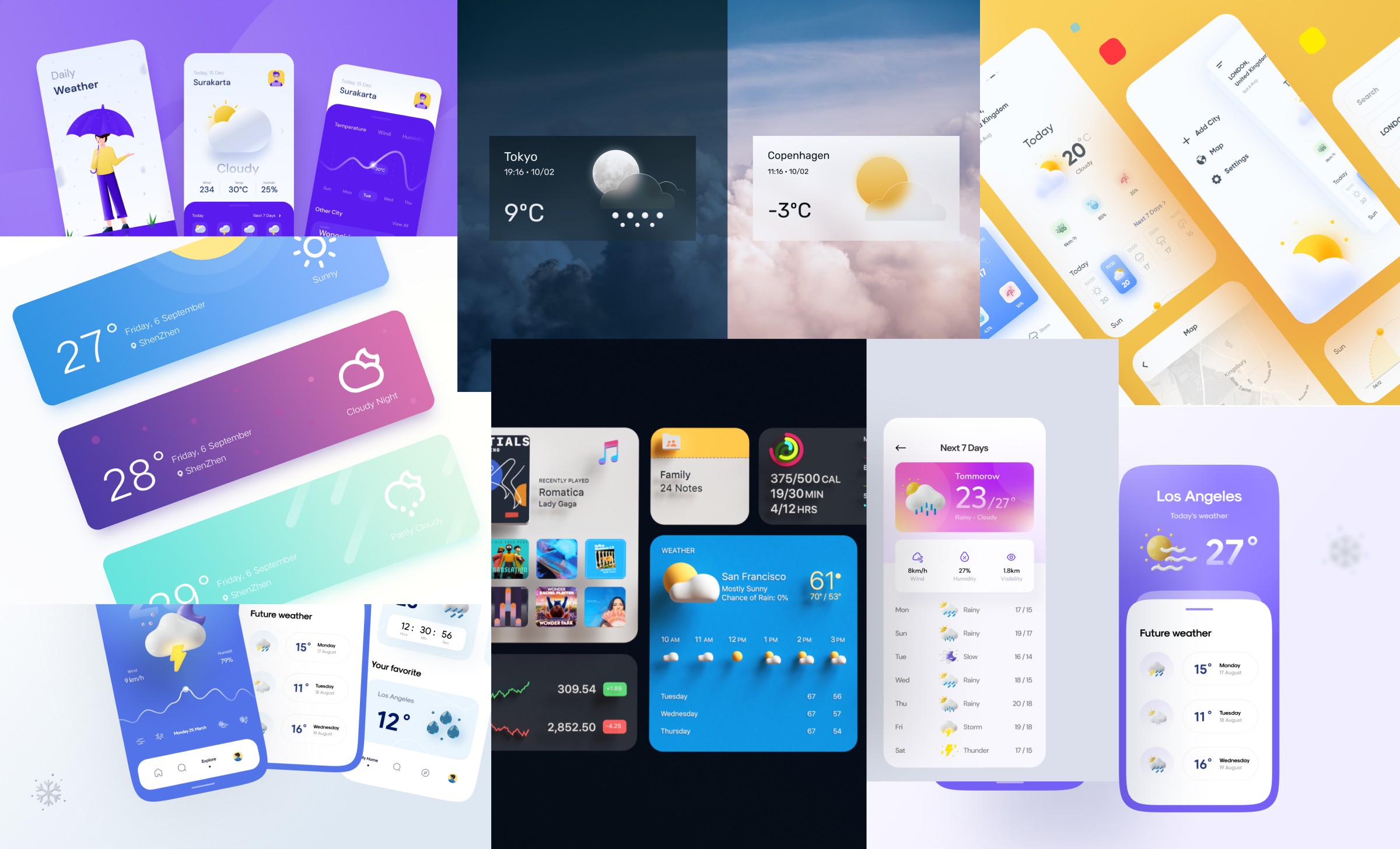
Before I moved on to high fidelity design, I looked through a lot of weather interface design references on Dribbble. This helped me establish the styles for visual design.

Design Showcase
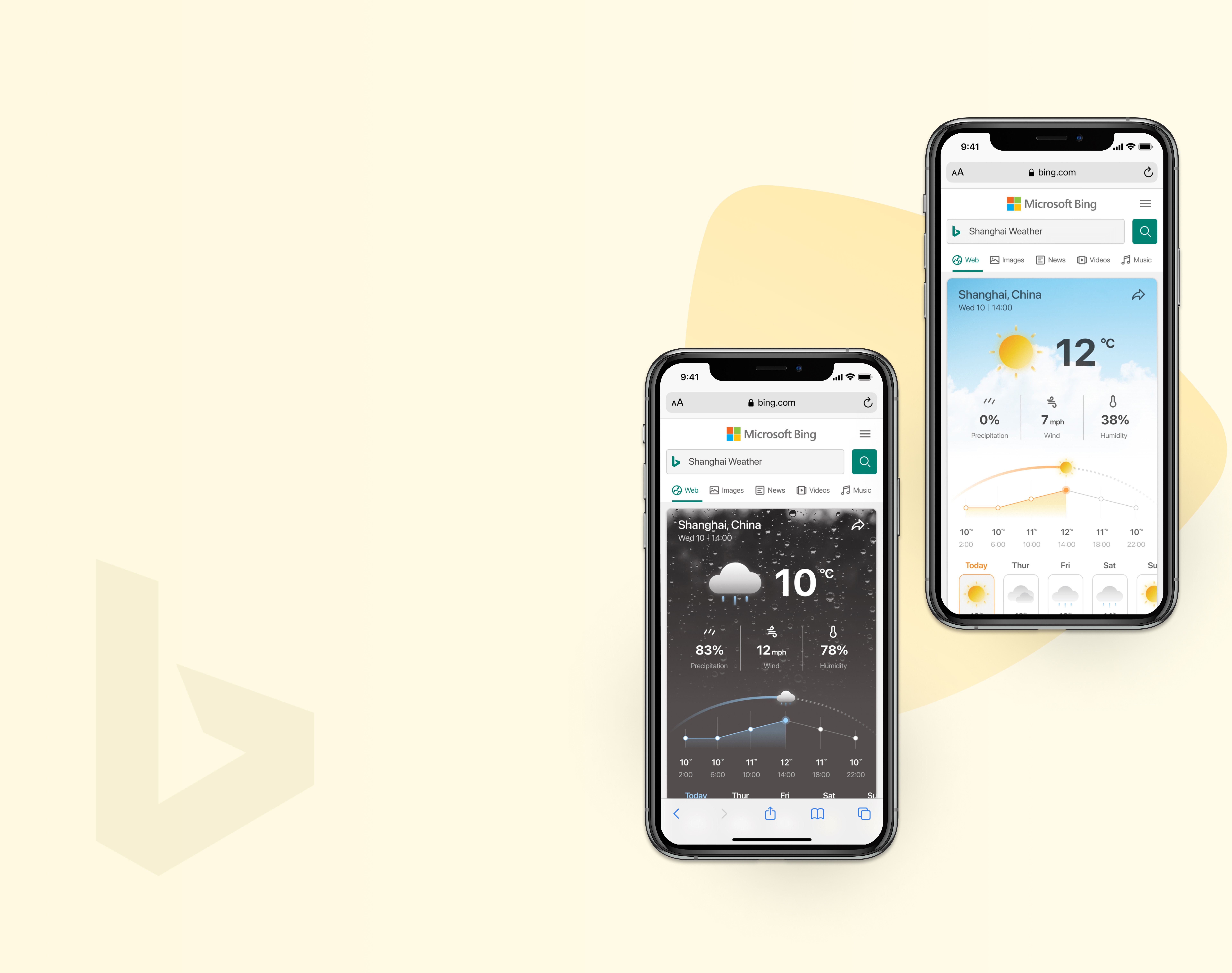
Based on the sketches and visual references, I used Figma to build out high-fidelity interfaces. Due to the time limit, I focused on two most typical weather conditions: sunny and rainy.


Originally, when users wanted to switch pages on Bing, they would have to scroll down to the bottom and hit the pagination button manually. This could be tedious and inconvenient. However, with a Pinterest layout, users can scroll up and down to browse page content continuously, which can ensure a more smooth user flow. Thus, even a minor interaction can bring magic to user experience.
Before the design tasks, I had little experience in weather or search engine design. To kick off this project, I spent lots of time researching related design exemplars, which gave me a basic sense of the relevant design patterns. This really helped me get the hang of weather and search engine design.
Previous
UP next

